
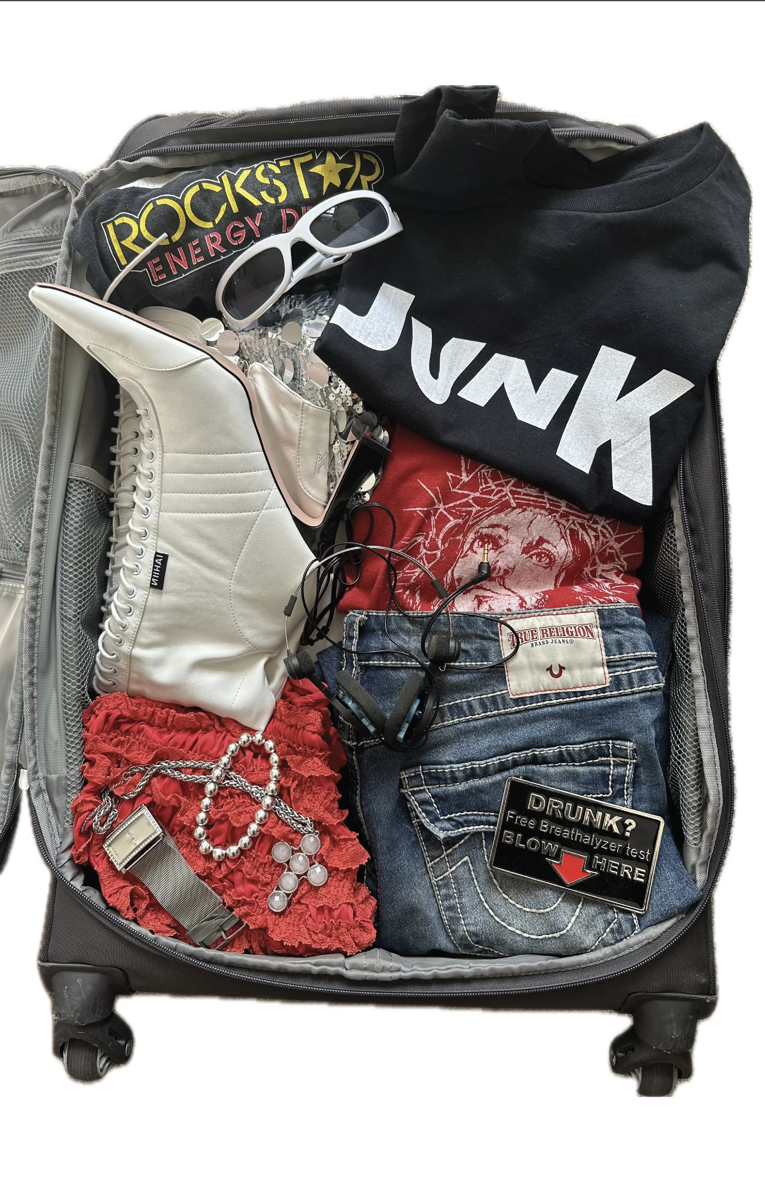
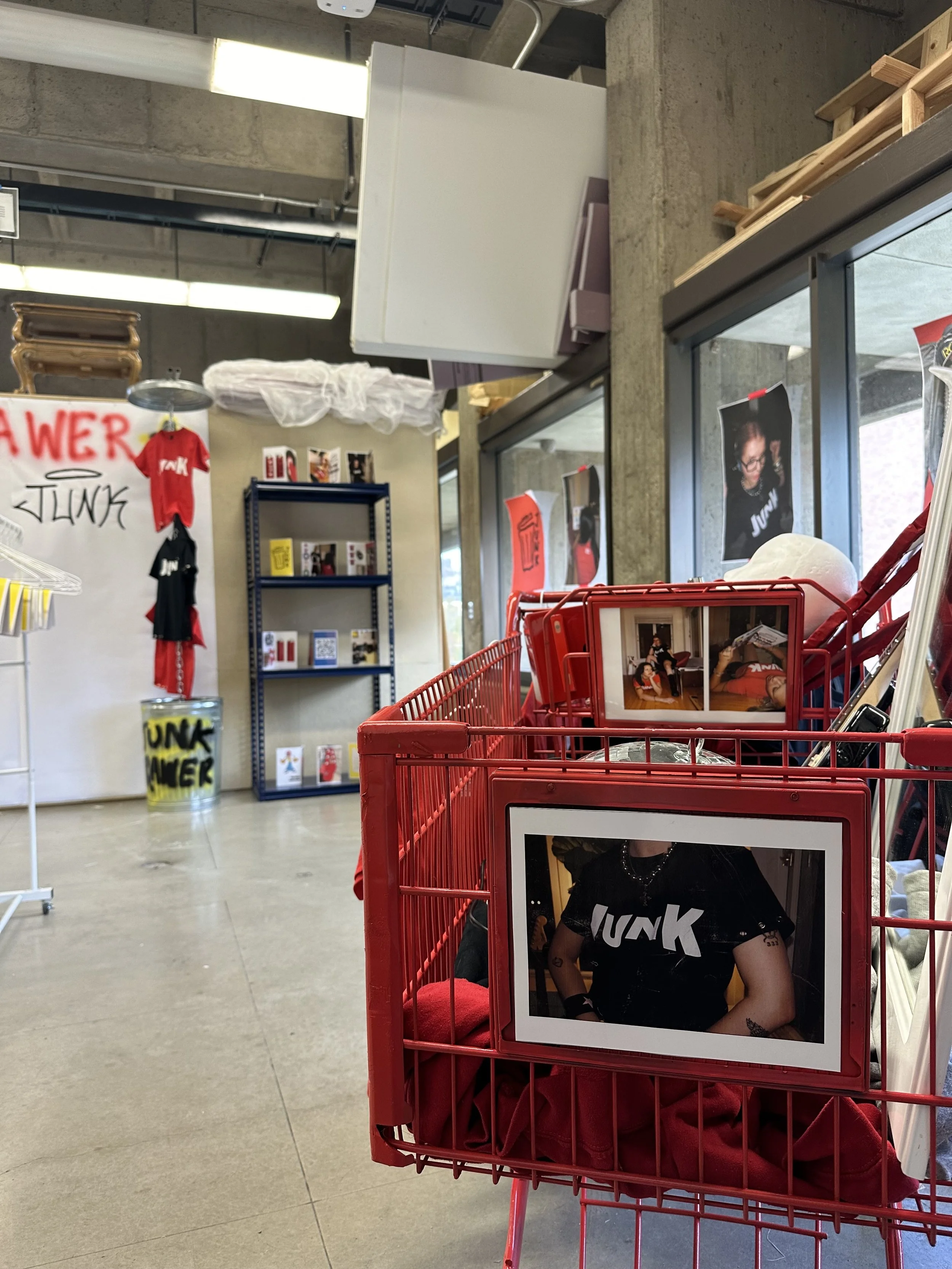
junk drawer
Junk Drawer is a clothing brand I created as my Senior Capstone project at the University of Utah. Although it was physically born at school, the idea existed for years before I ever brought it to life. This is the website where it lives, so in case you haven’t already, feel free to look around. If you want to get more into the nitty-gritty of my creative process, you’ll find that here.

Junk drawer embodies the core of my artistic expression
I love the challenge of telling a story through different forms of art. My style blends bold and whimsical elements resulting in playful experimentation throughout my process.
I gravitate towards intentional chaos and strong visual narratives to bring the world of junk drawer to life.

creative direction ★
creative direction ★
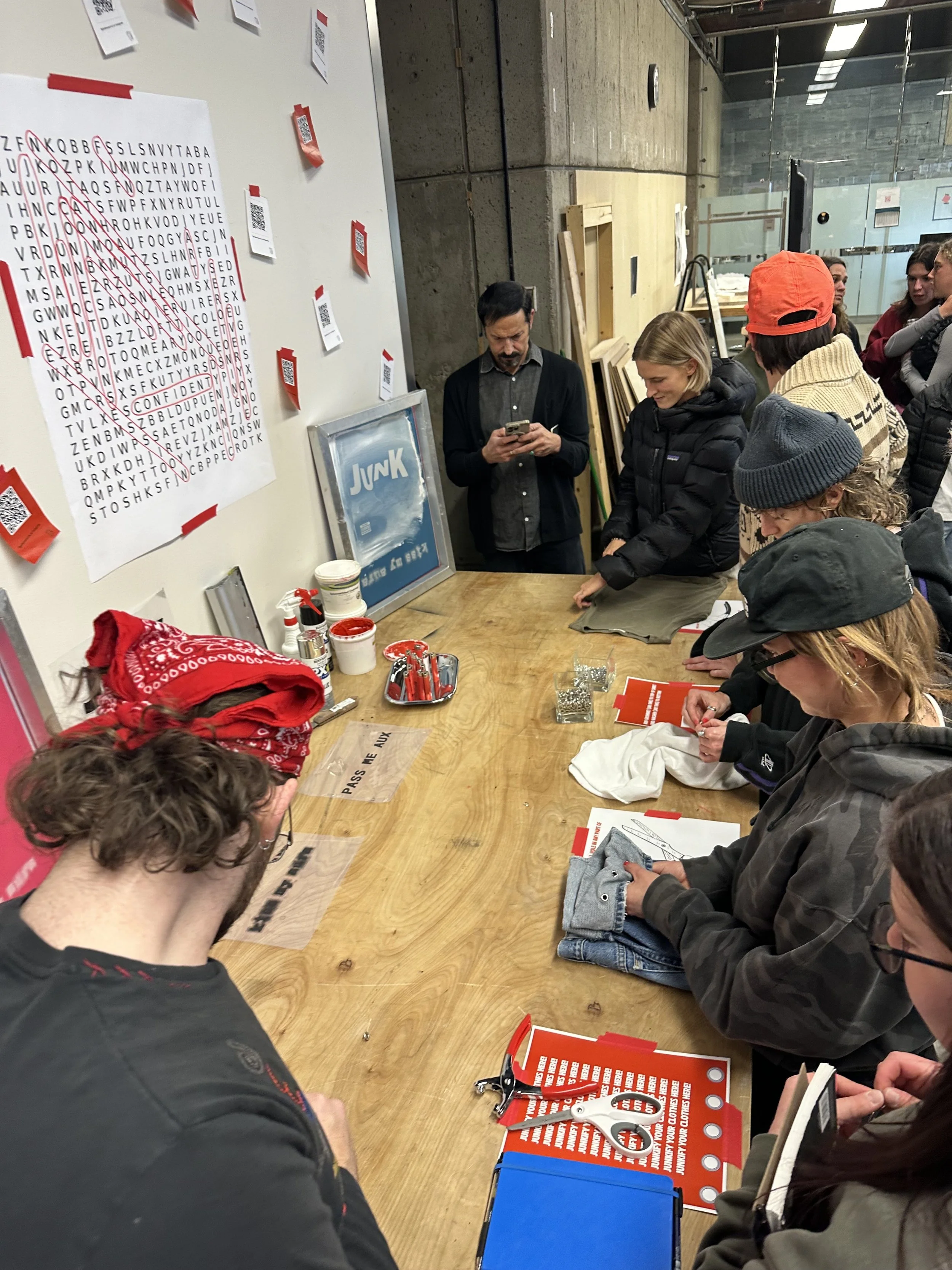
From coming up with a concept, to finding locations, to recruiting models and photographers, one of the best parts of Junk Drawer has been creative directing the shoots for each launch.
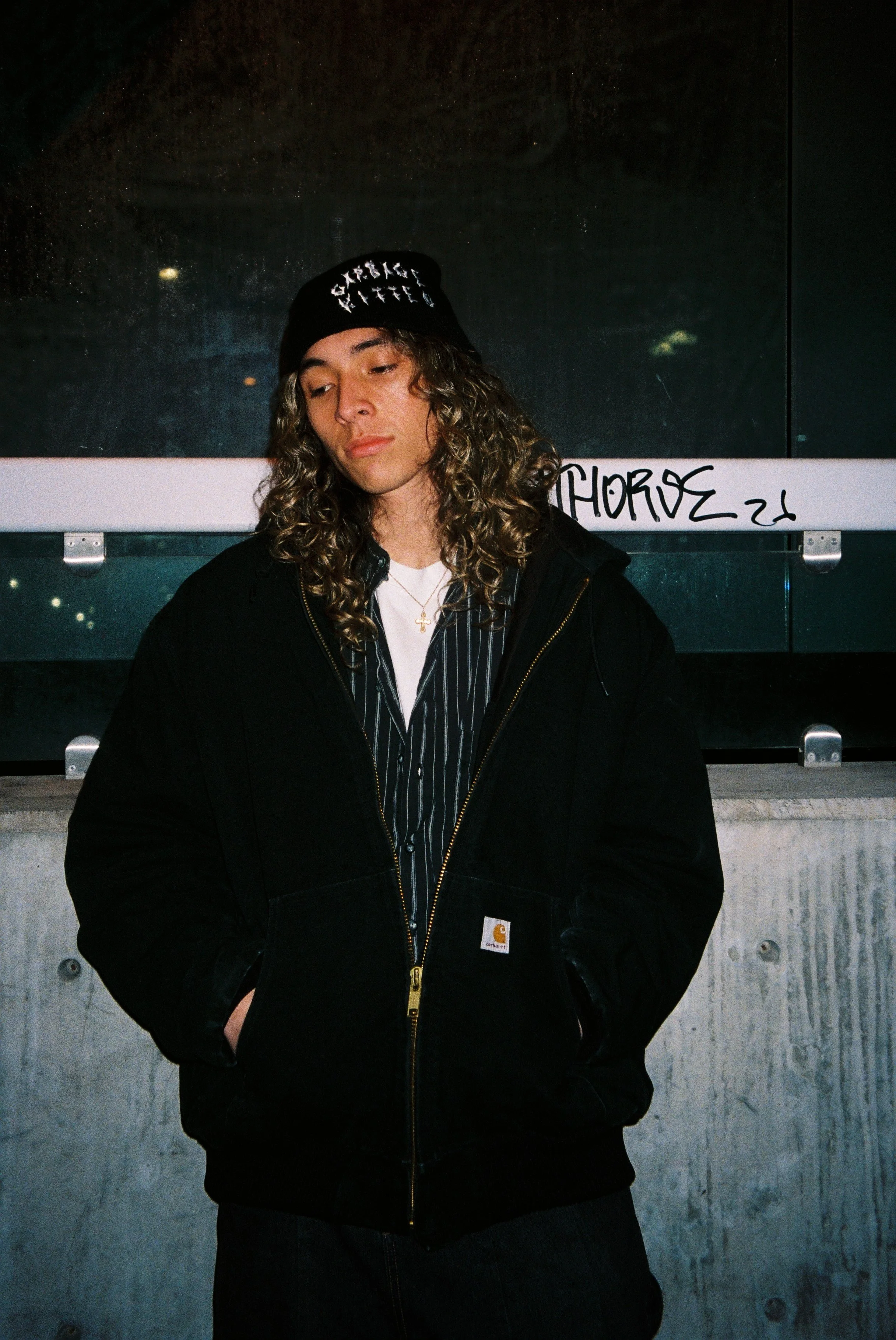
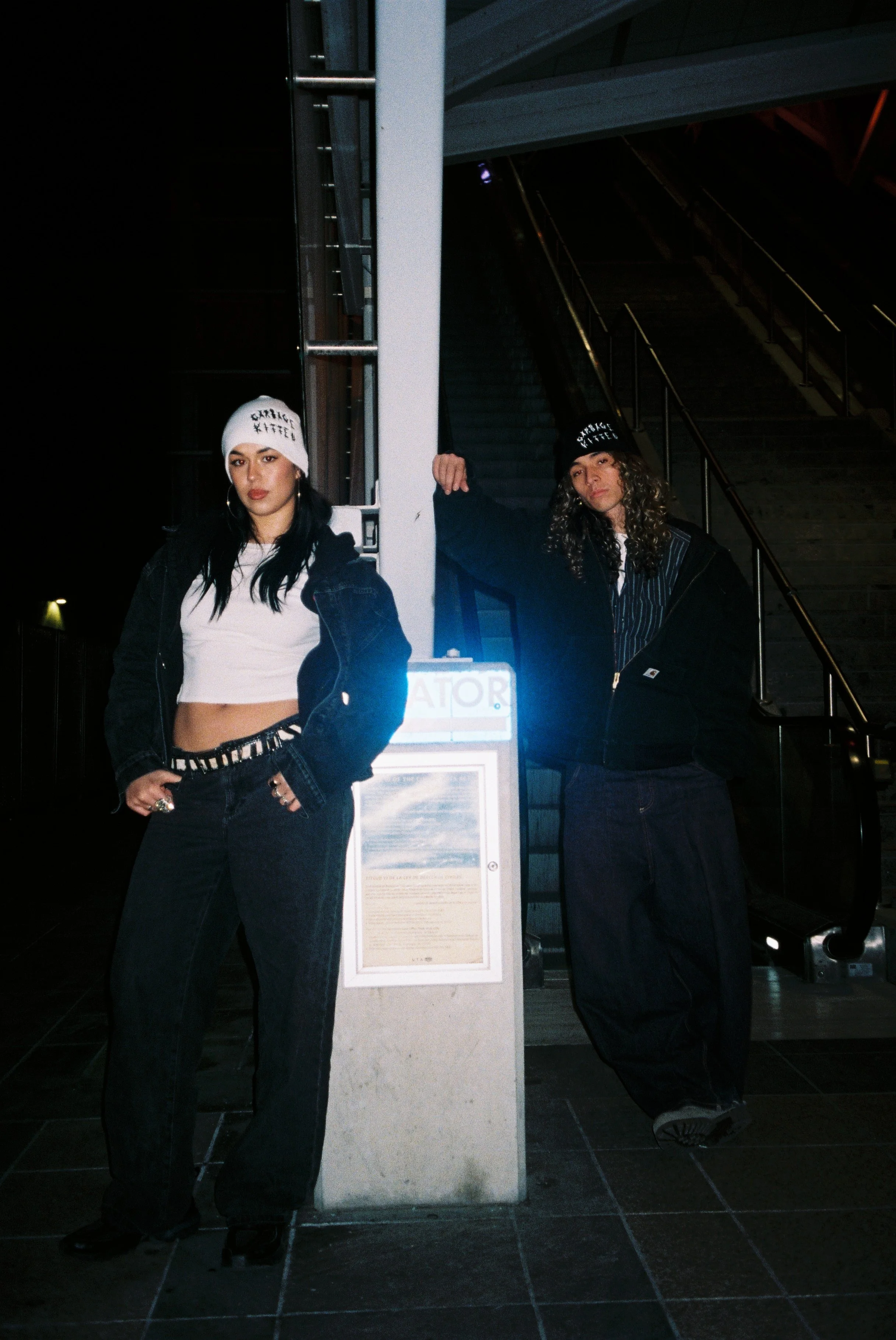
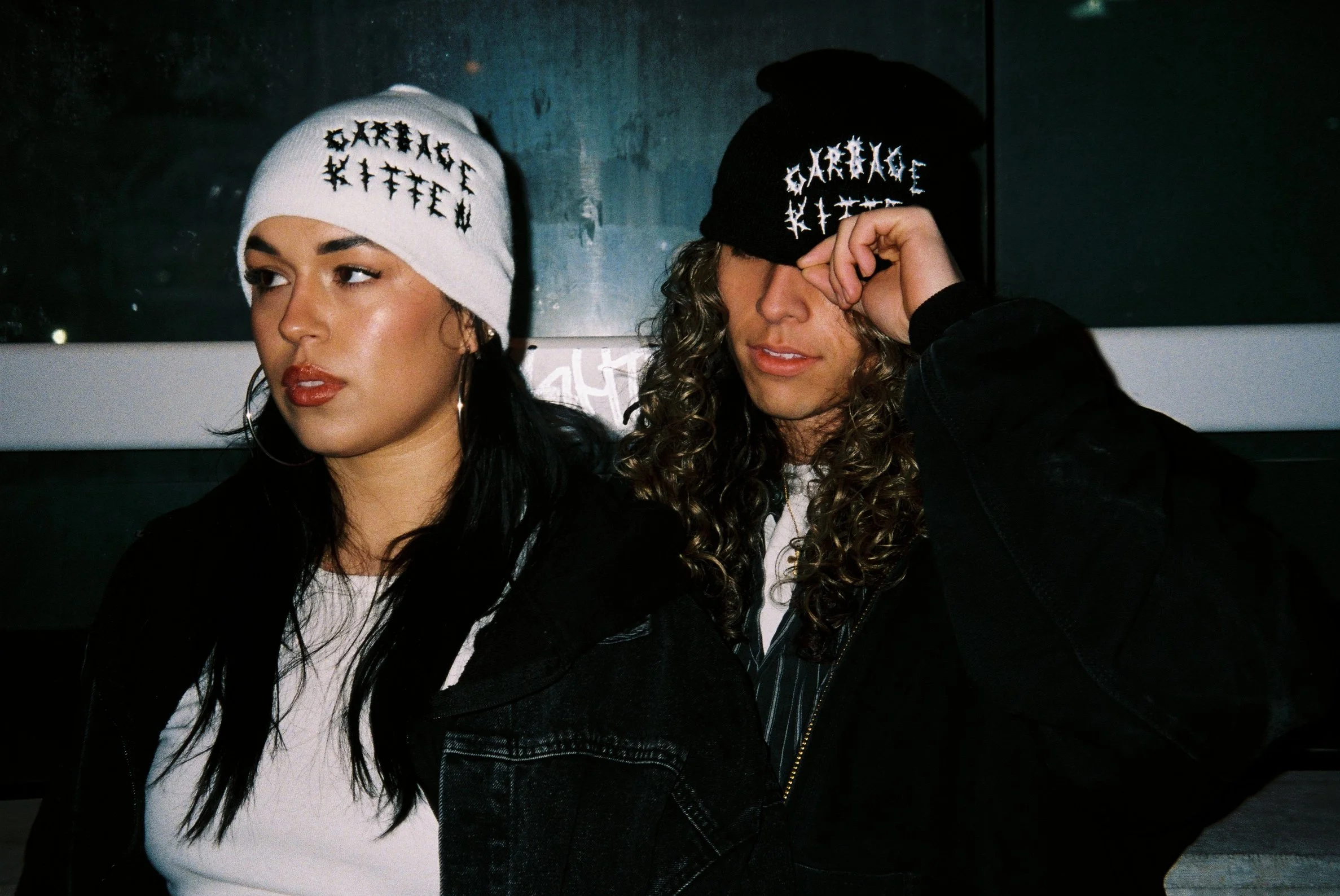
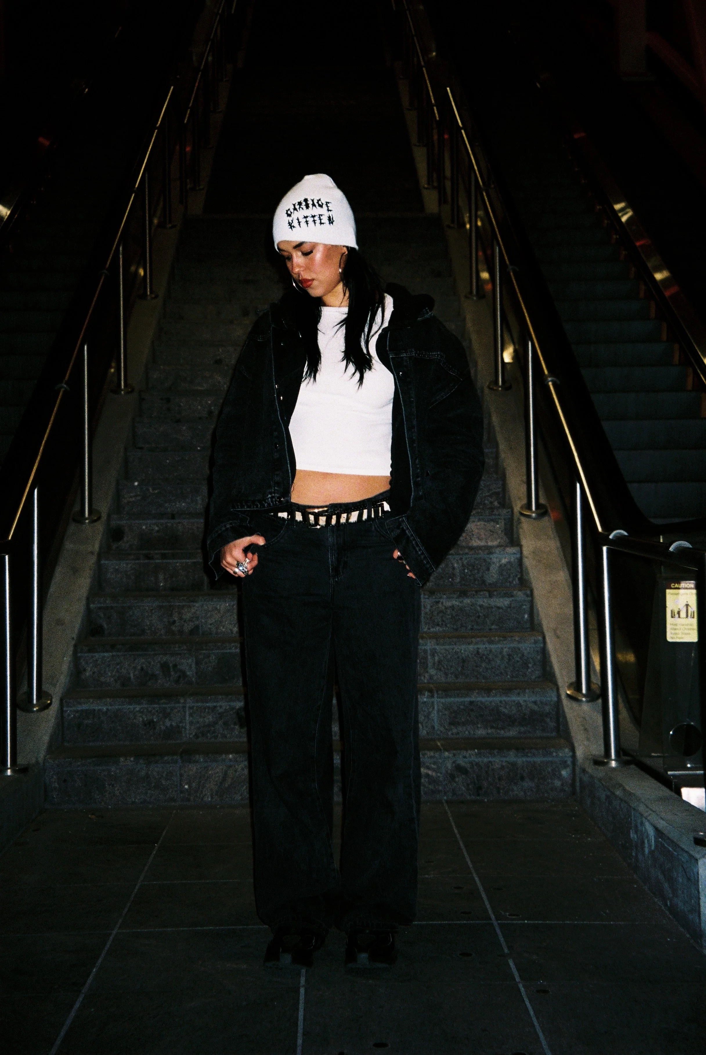
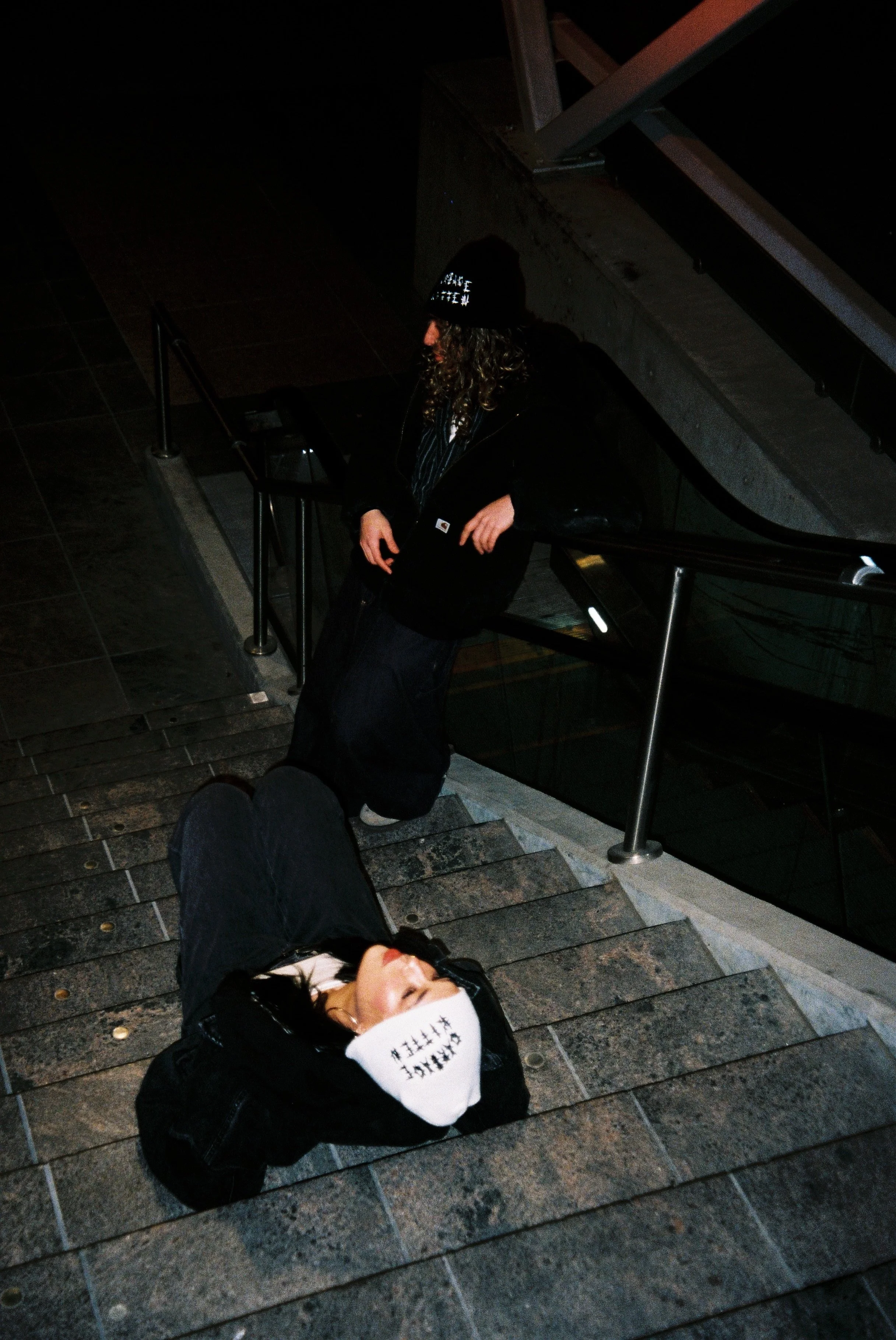
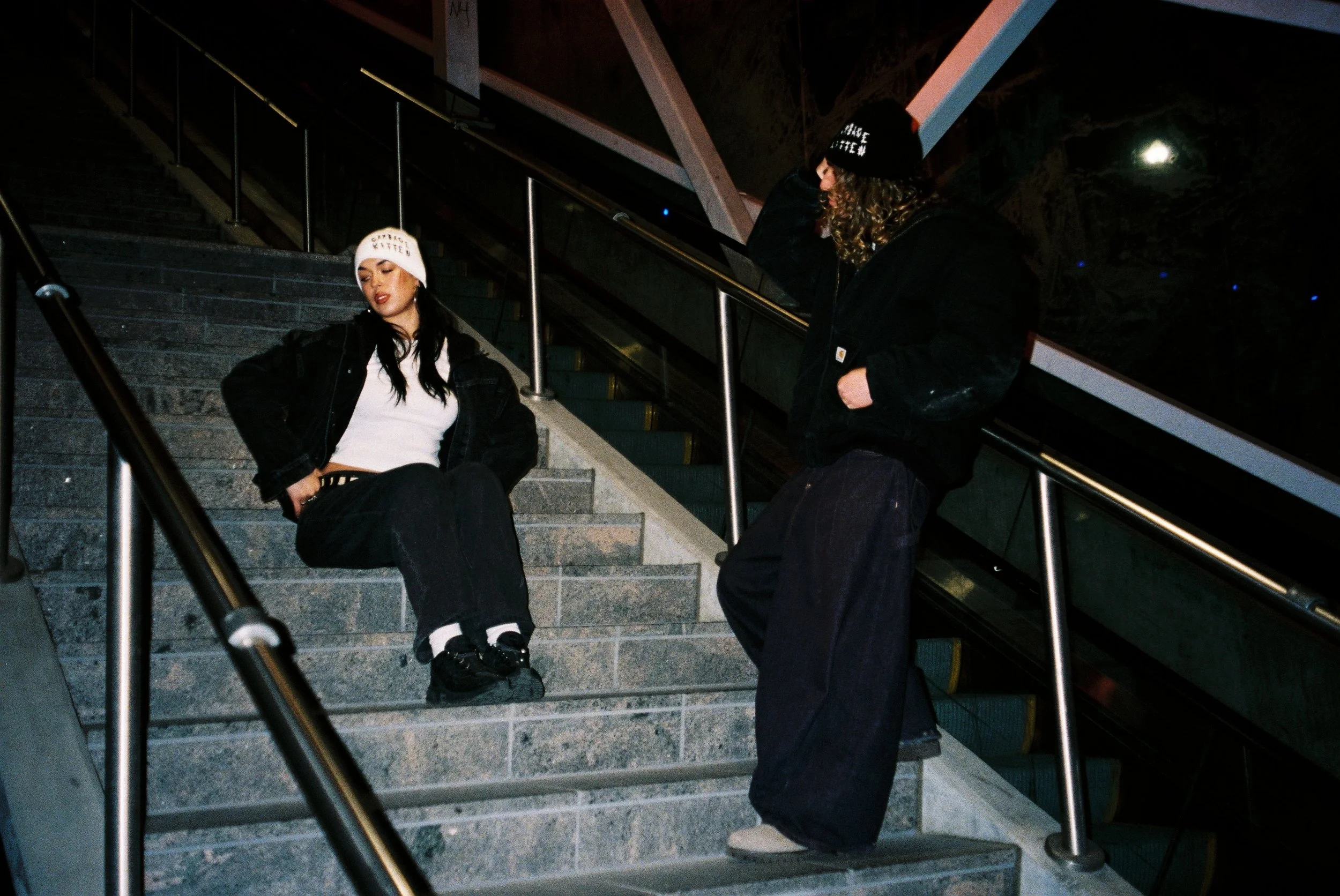
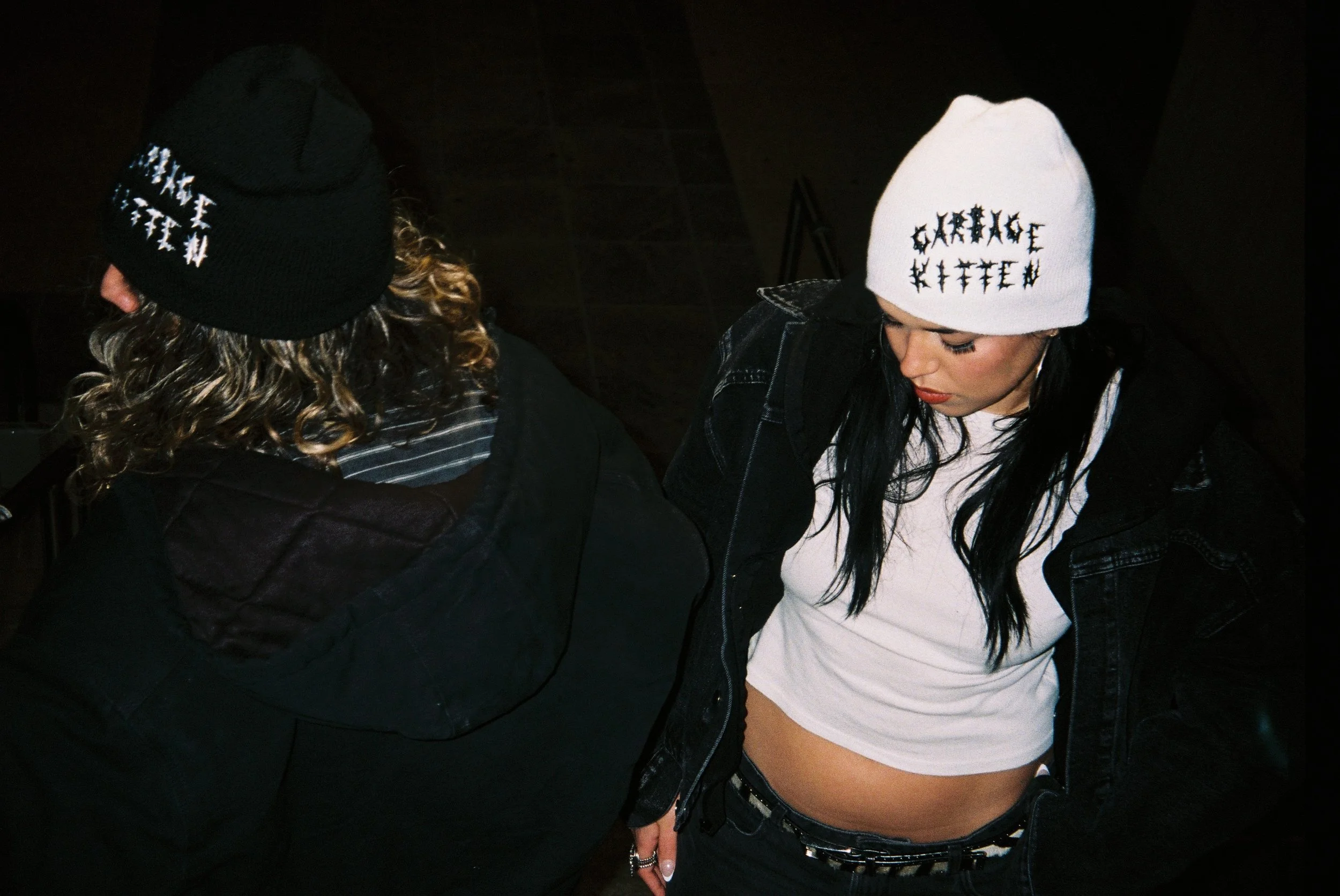
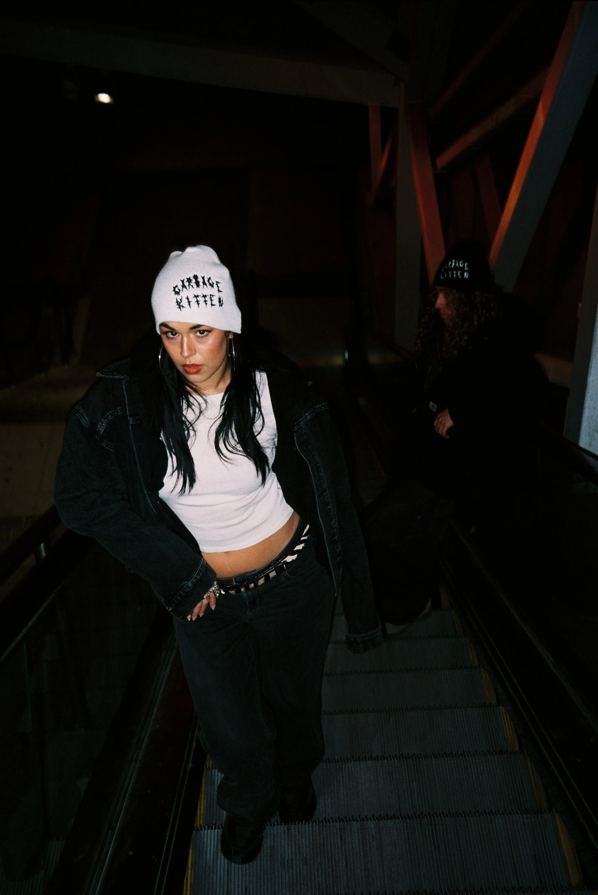
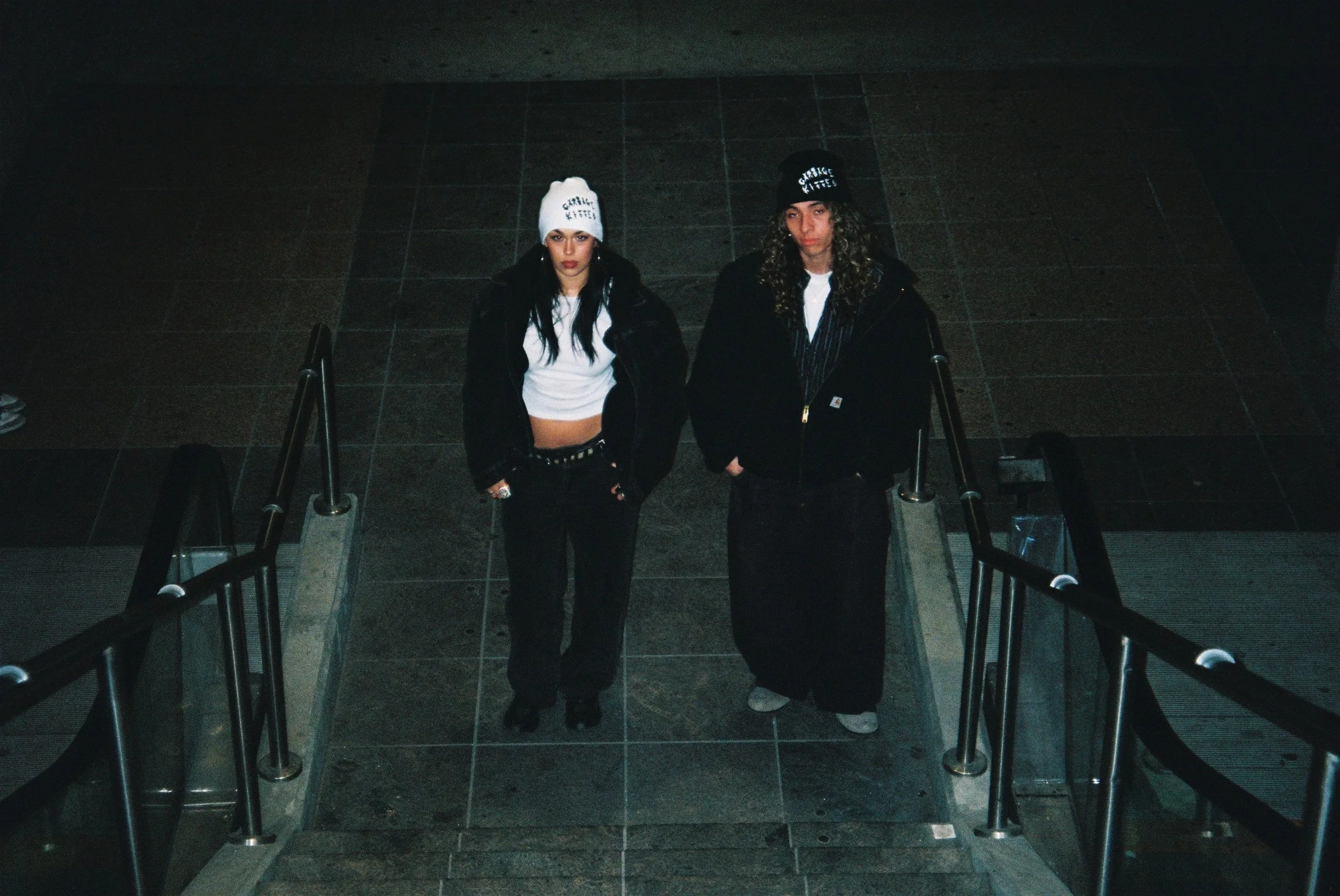
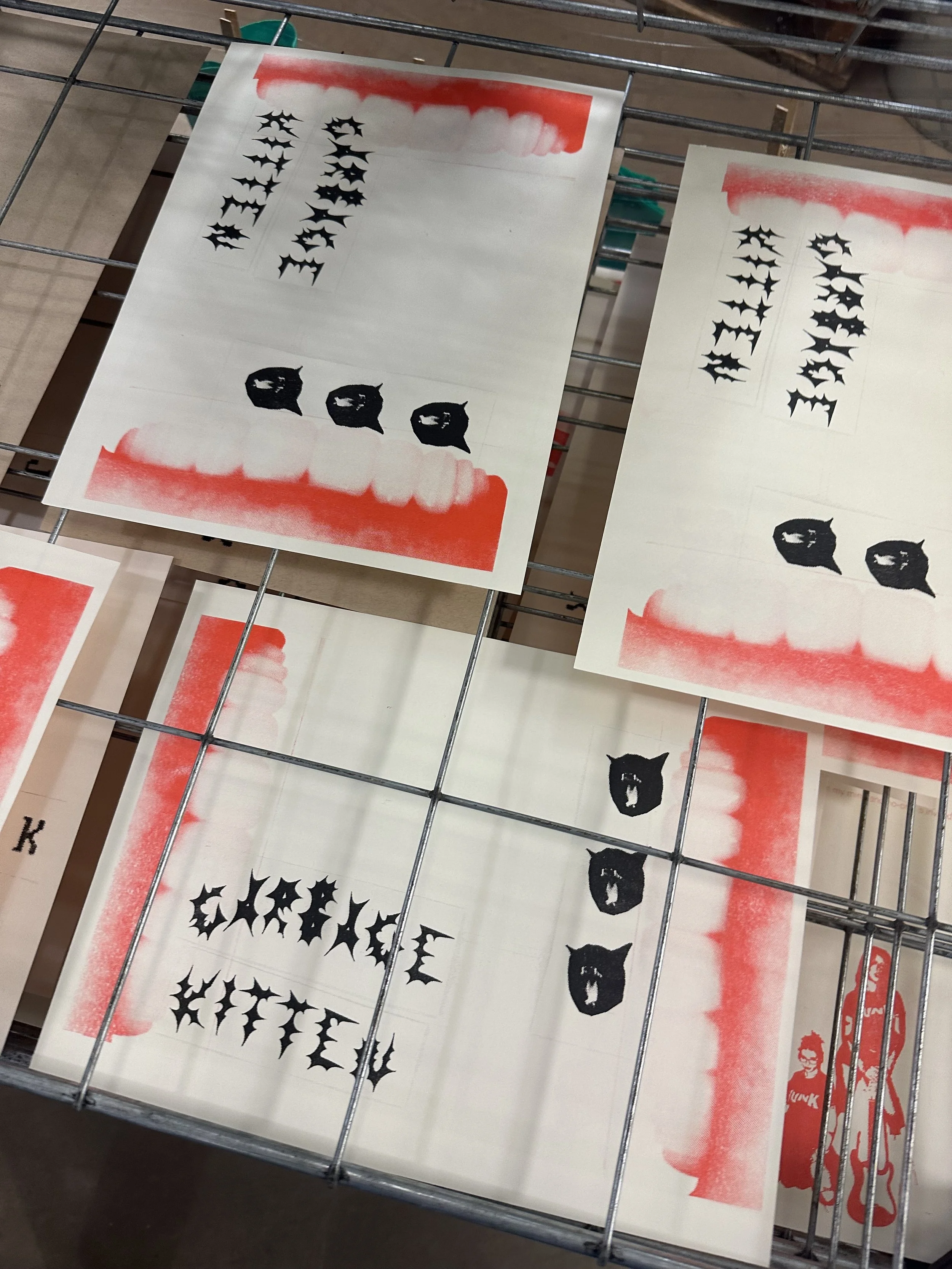
The “Garbage kitten” beanie
The Garbage Kitten beanie is the most recent addition to the junk drawer collection, and there was definitely some troubleshooting that came along with it. This was the first time I had worked with a manufacturer on one of my pieces, and it allowed me to expand my skills as a fashion designer and exercise my ability to remain diligent even when there are unexpected delays. After numerous emails and samples, the garbage kitten beanie was born. I wanted the marketing to feel very natural this time—no props, no crazy poses, just some kids on their way to who knows where in a piece that stands out from the rest of their outfit. I went to TikTok to find models, which was a new method for me. Unfortunately, my original female model fell through at the last minute, but after a week, the video had gotten over 10k views, and I gained a little bit more community, so the garbage kitten beanie has a very special place in my heart. :)
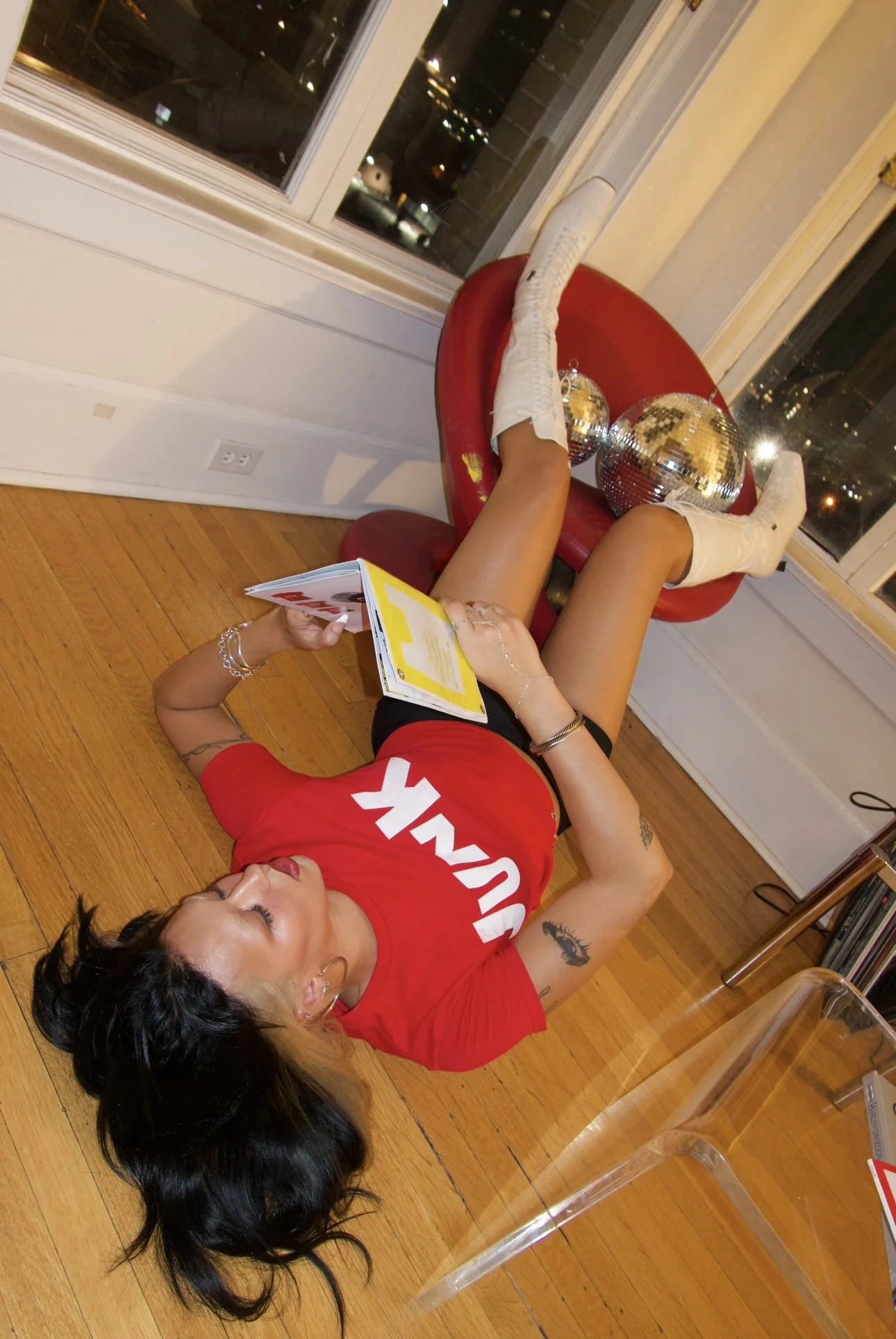

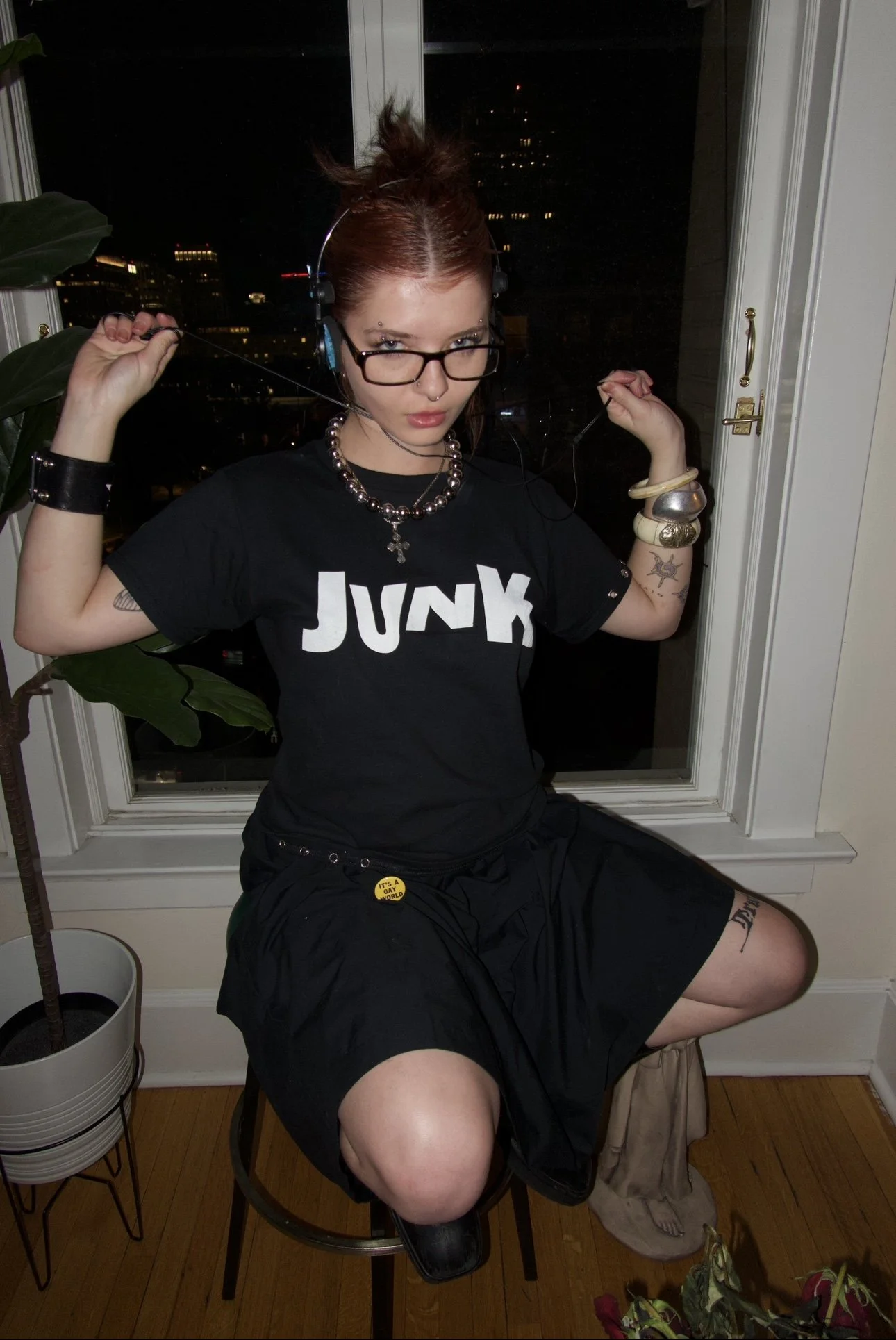
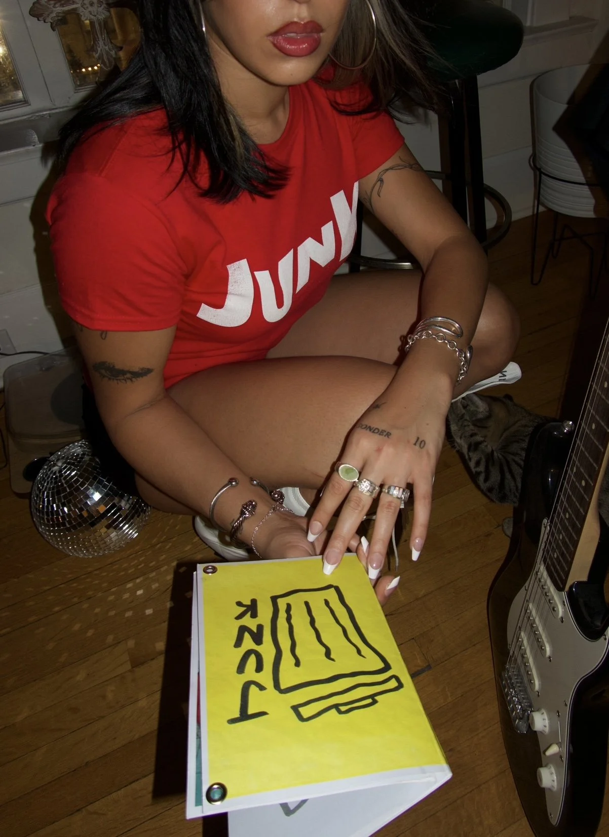

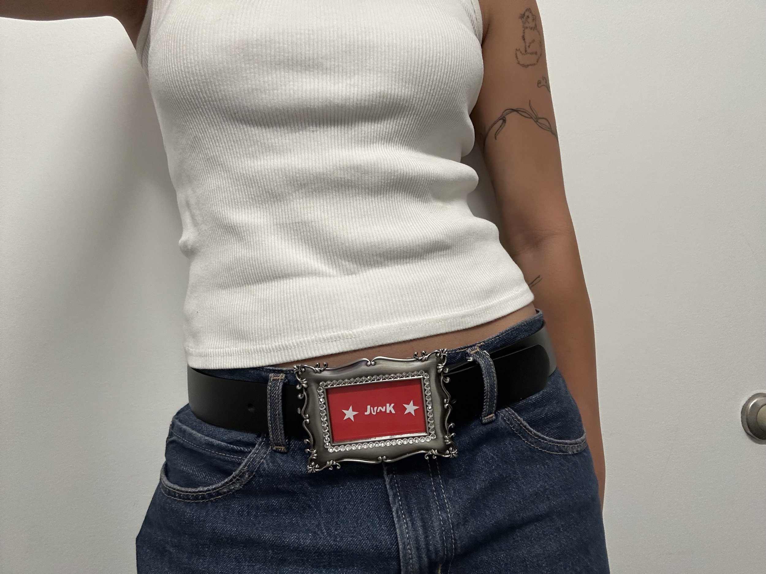
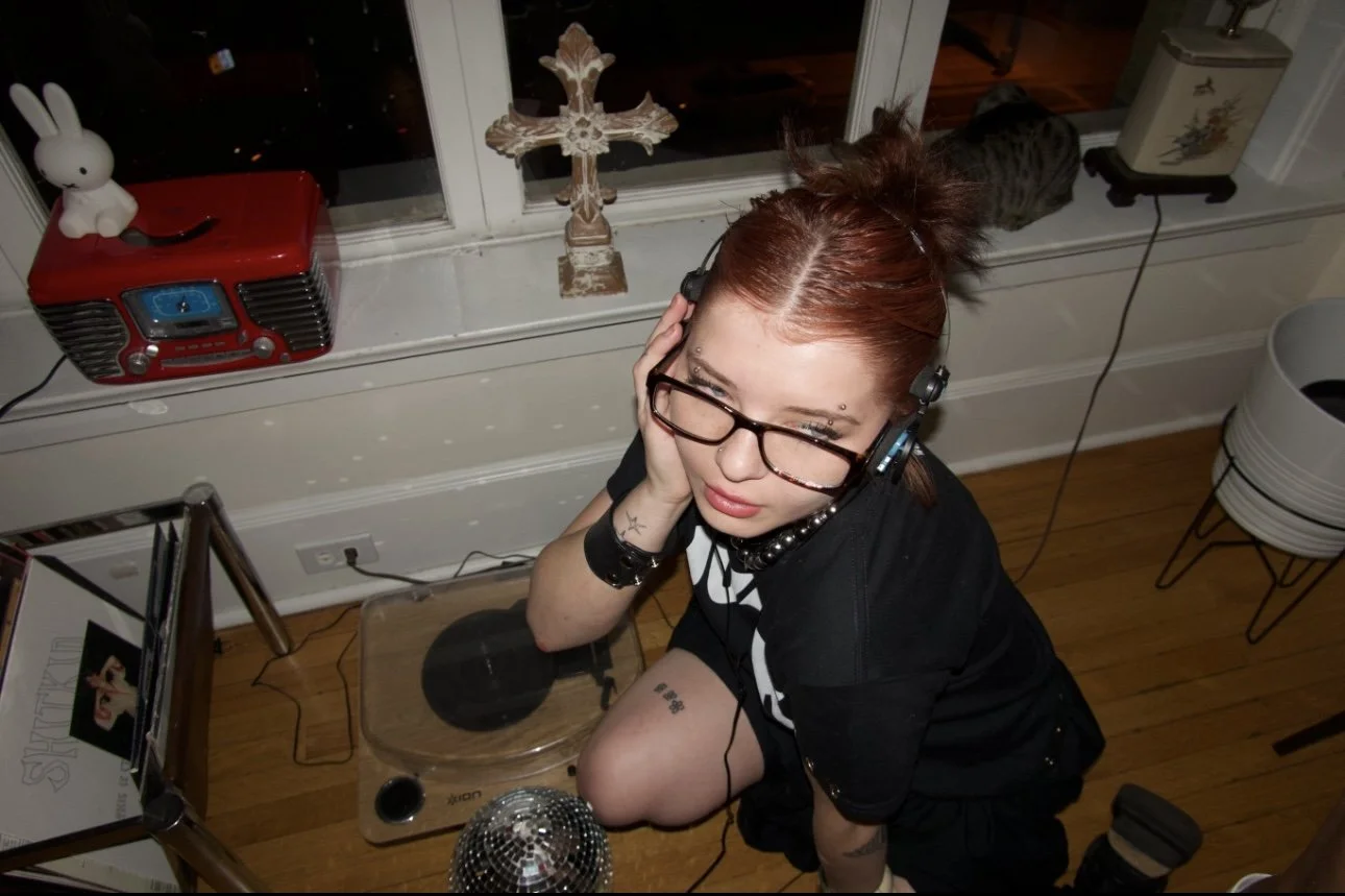
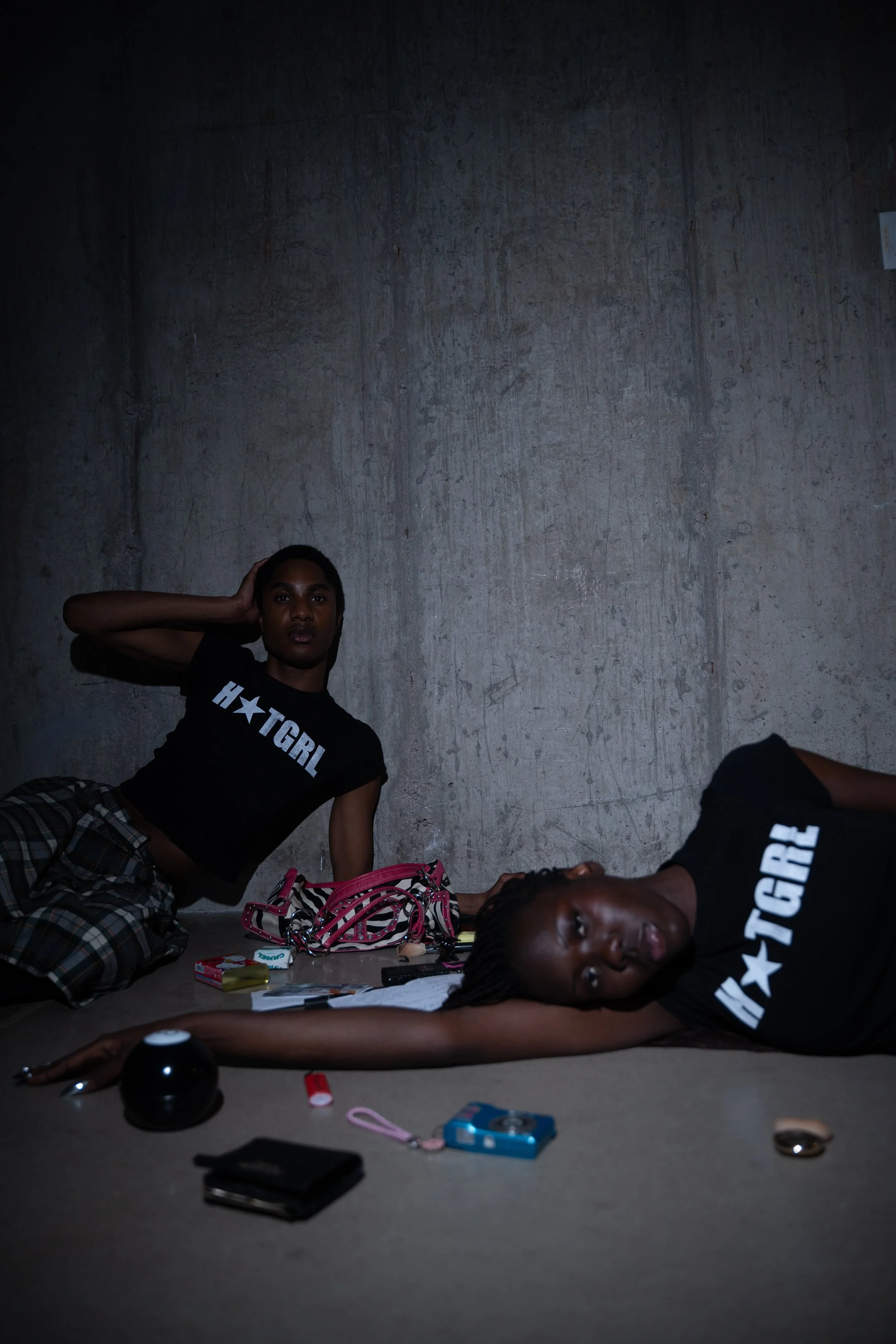
The ”Junk” Tee
We shot this shirt at Kate’s apartment on a digital camera. I wanted the styling to feel effortlessly thrown together — sort of a punk-casual mixed with early- 2000’s nightlife vibe. The space became part of the narrative, and shooting with one of my close friends made it feel like we were just hanging out after hours. My goal was for the photos to be intimate, messy, cool, and naturally expressive.
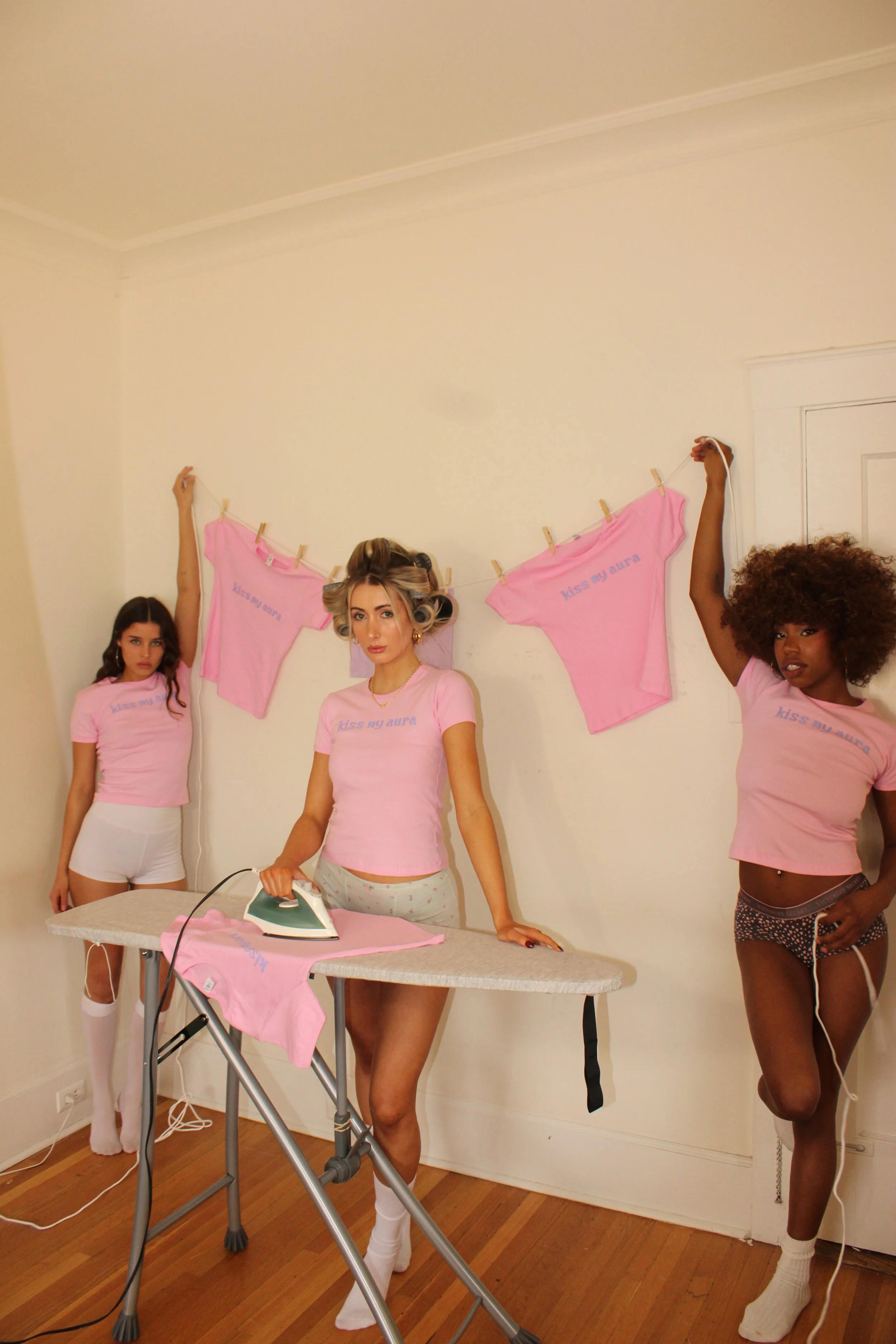
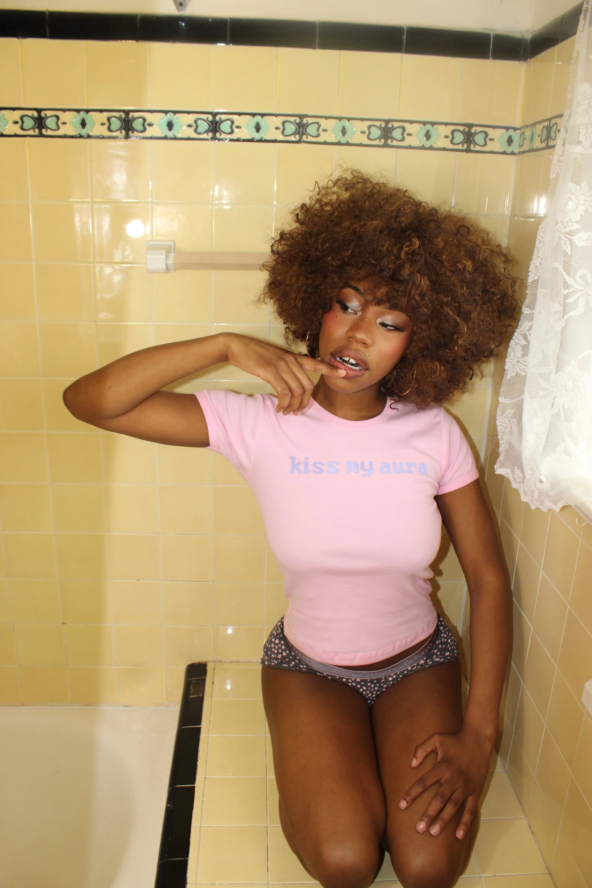
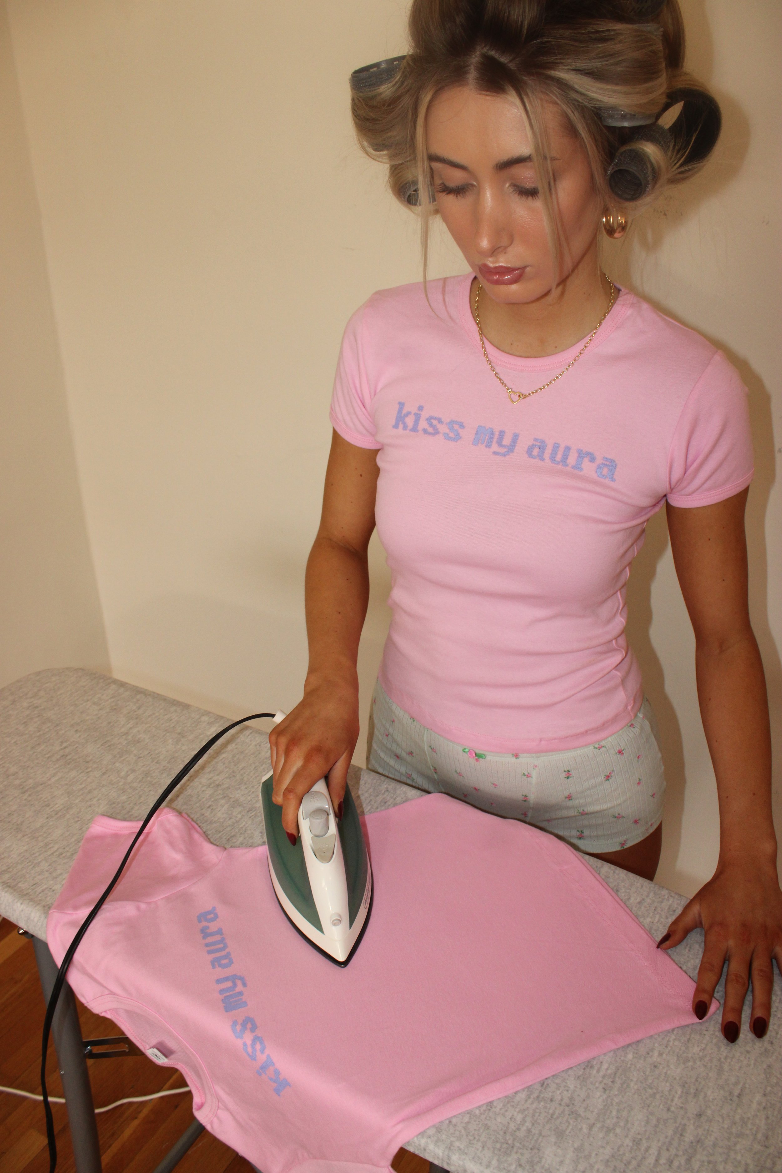
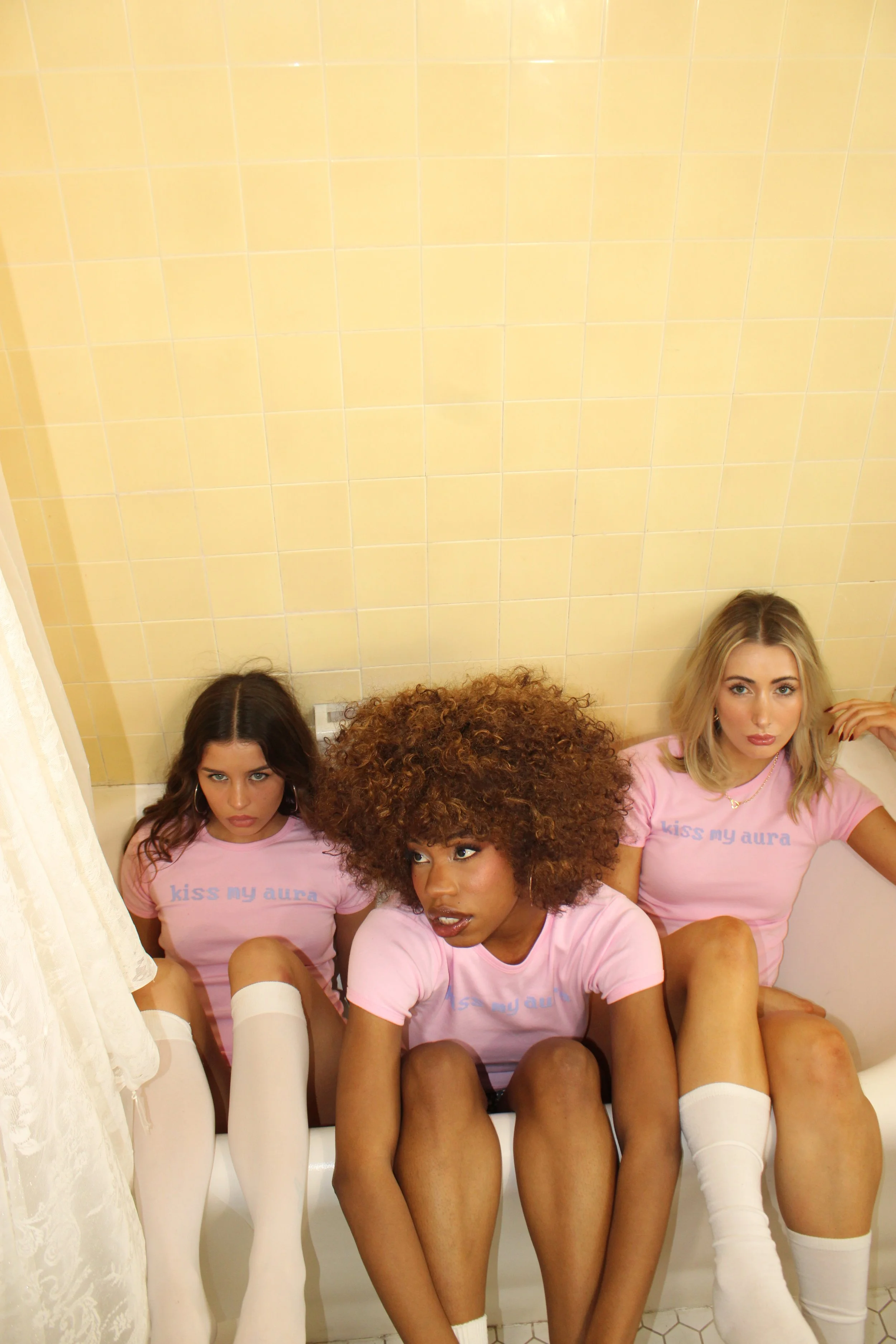
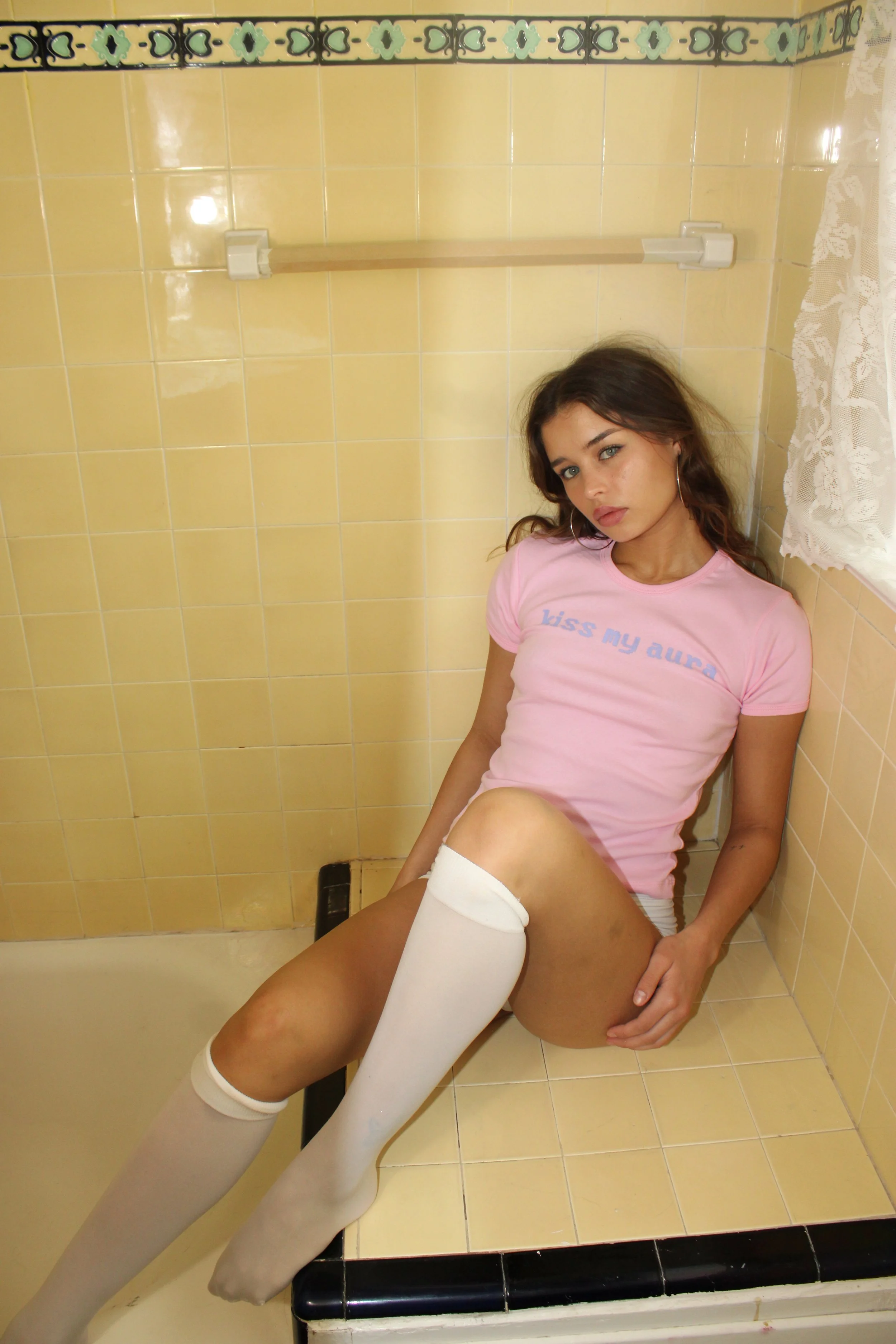
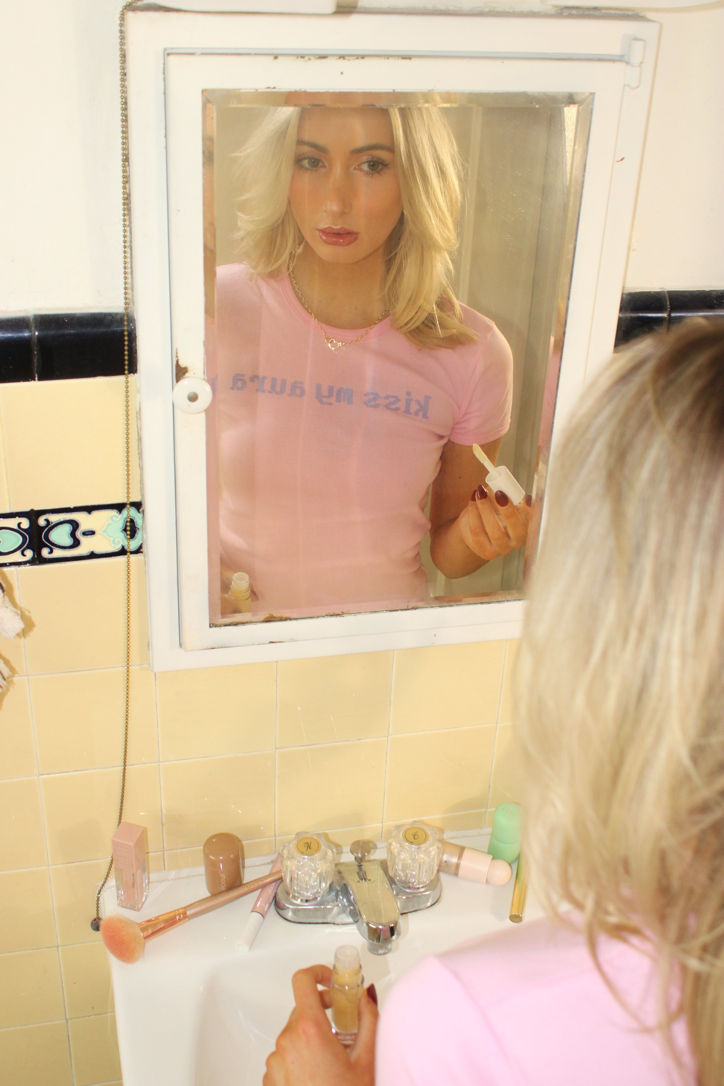
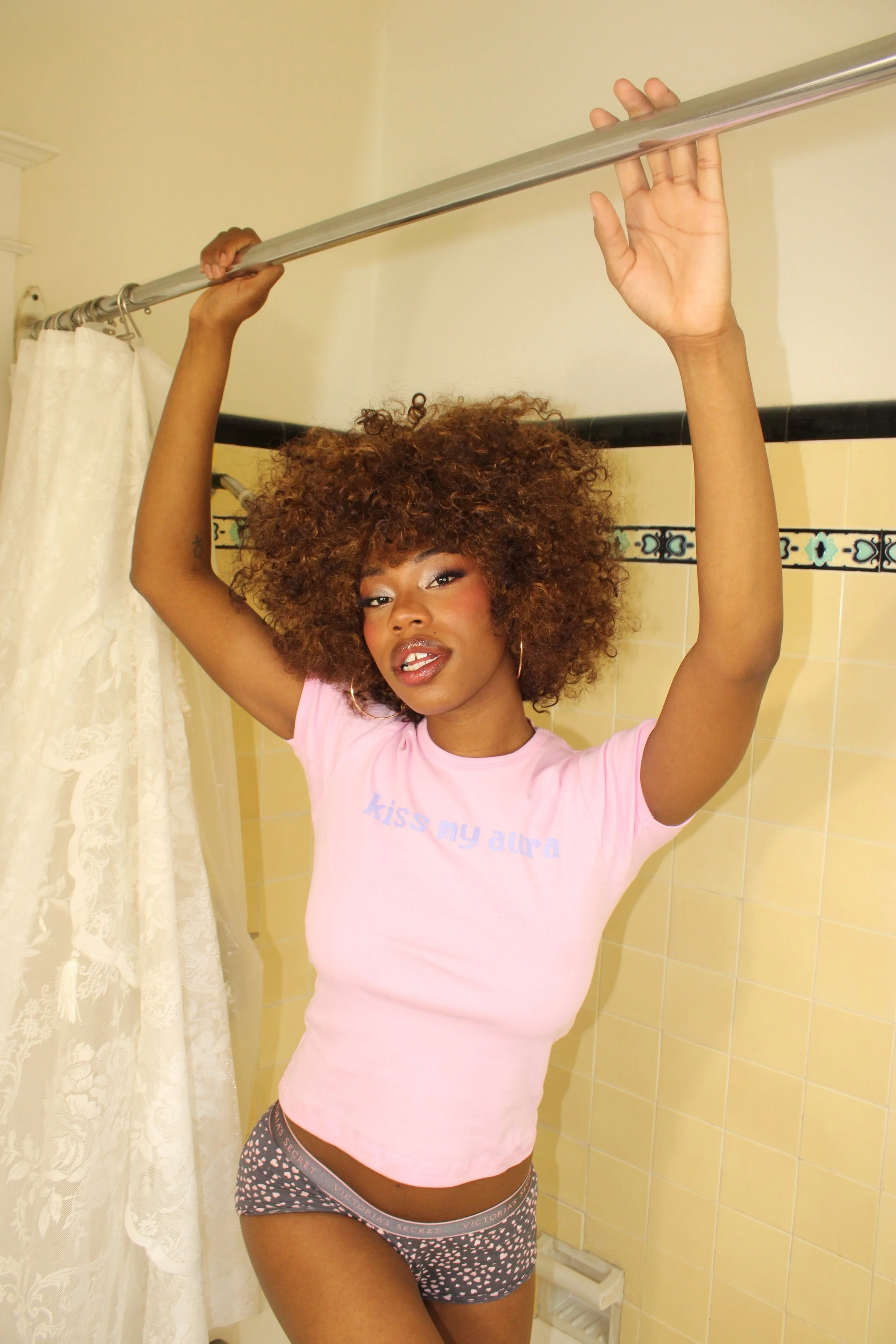
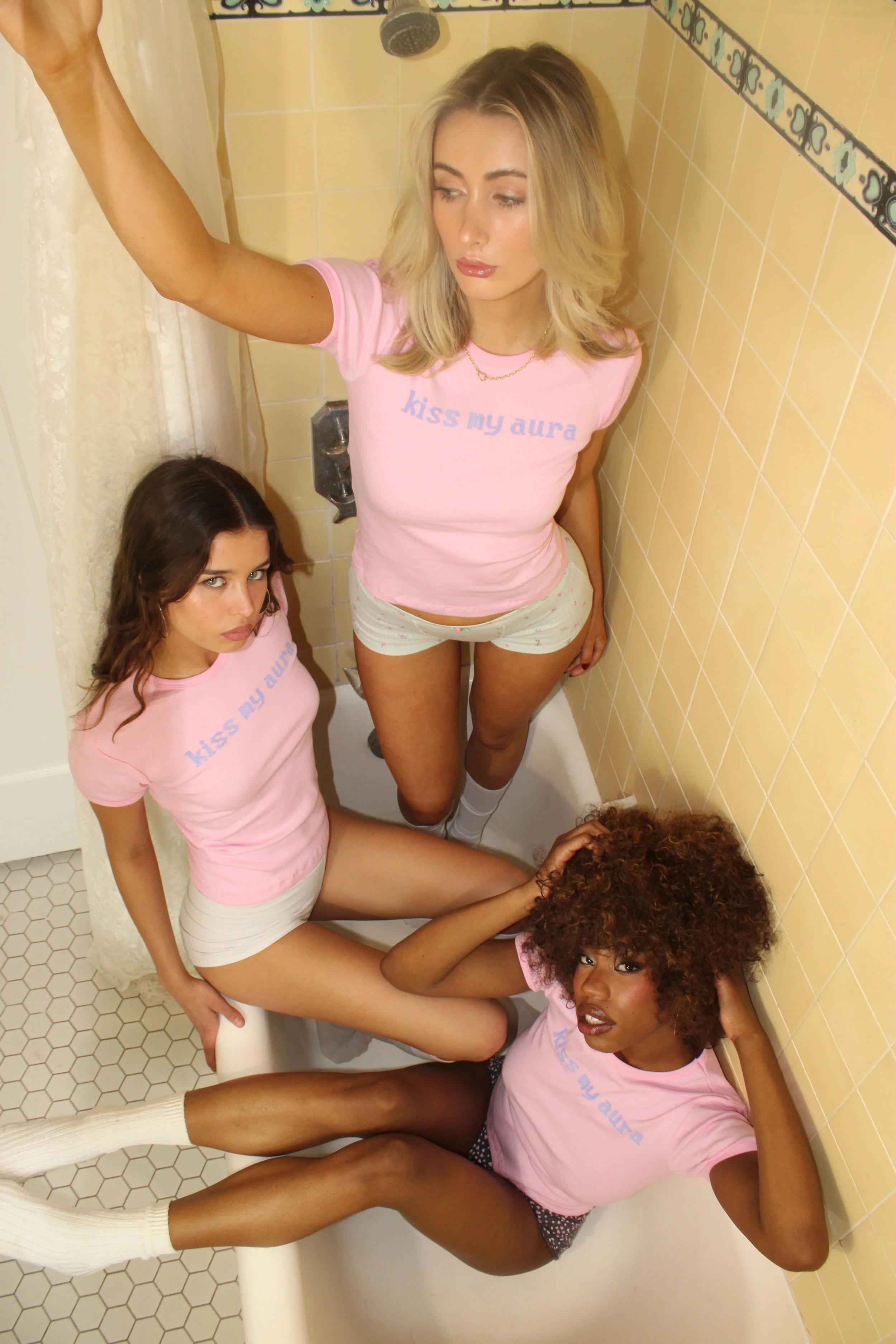
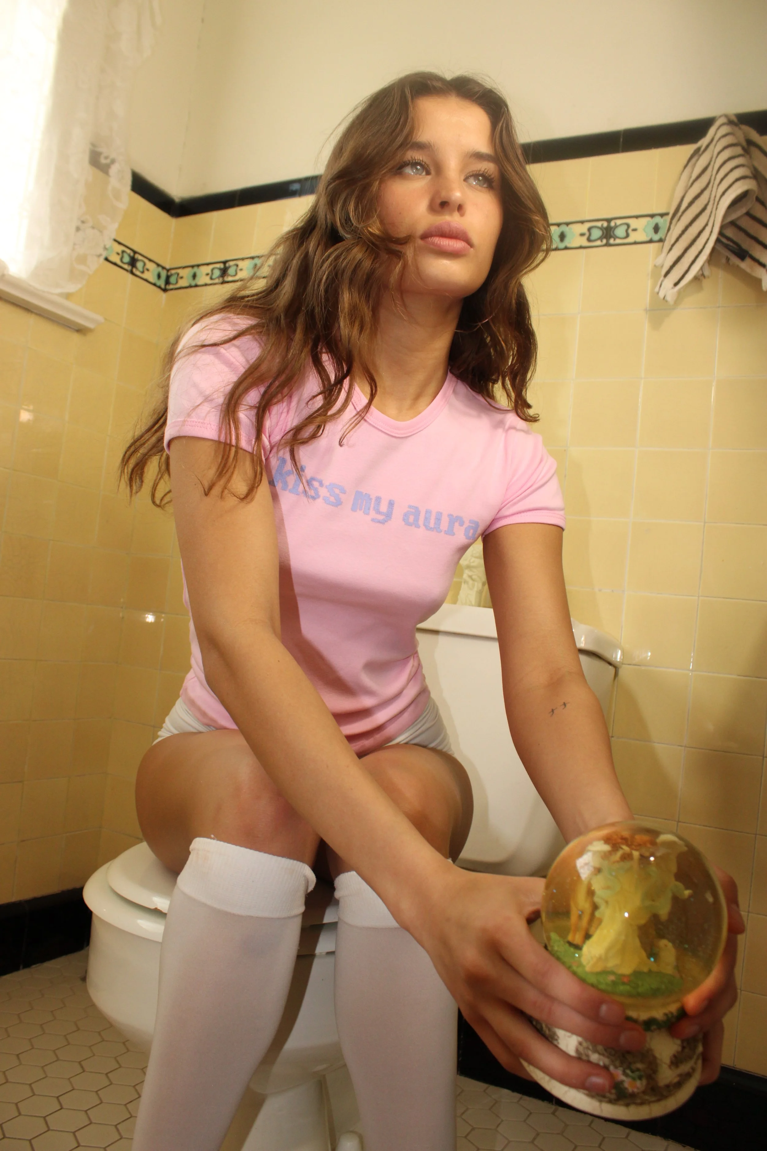
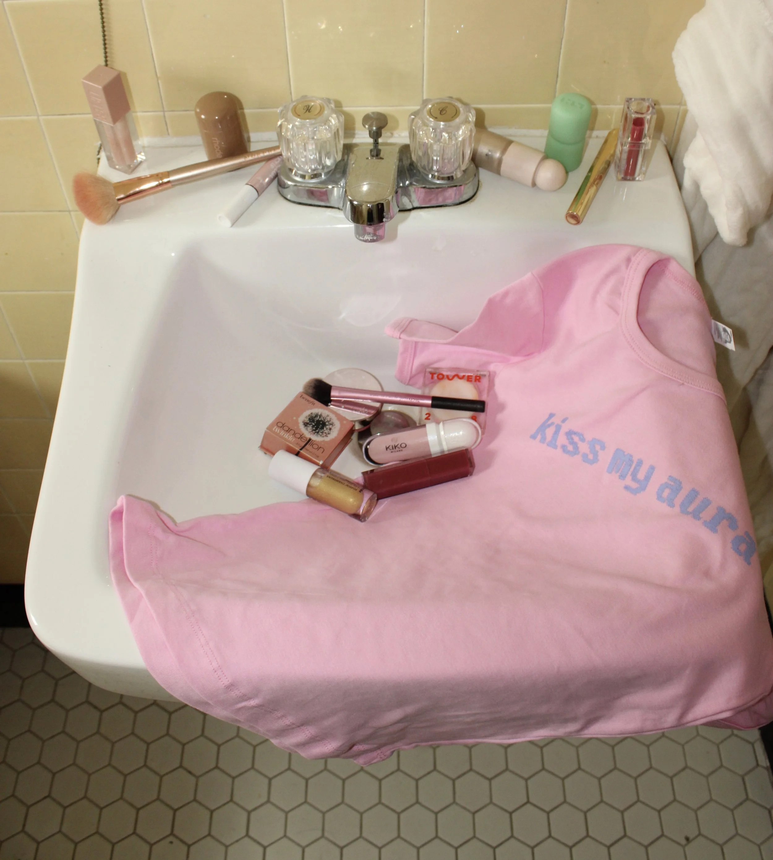
The “kiss my aura” tee
I really felt like the architect on this one because I was behind the camera, which is really new for me. I knew exactly what I wanted this launch to look like before I even made the shirt but there was definitely a lot of freestyling once we started shooting. I was laying in the bathtub and standing on the toilet to get all the girly, slumber party shots I was envisioning. The warm, lo-fi lighting and asymmetrical angles create that sassy innocence that perfectly reflects the energy of the shirt.
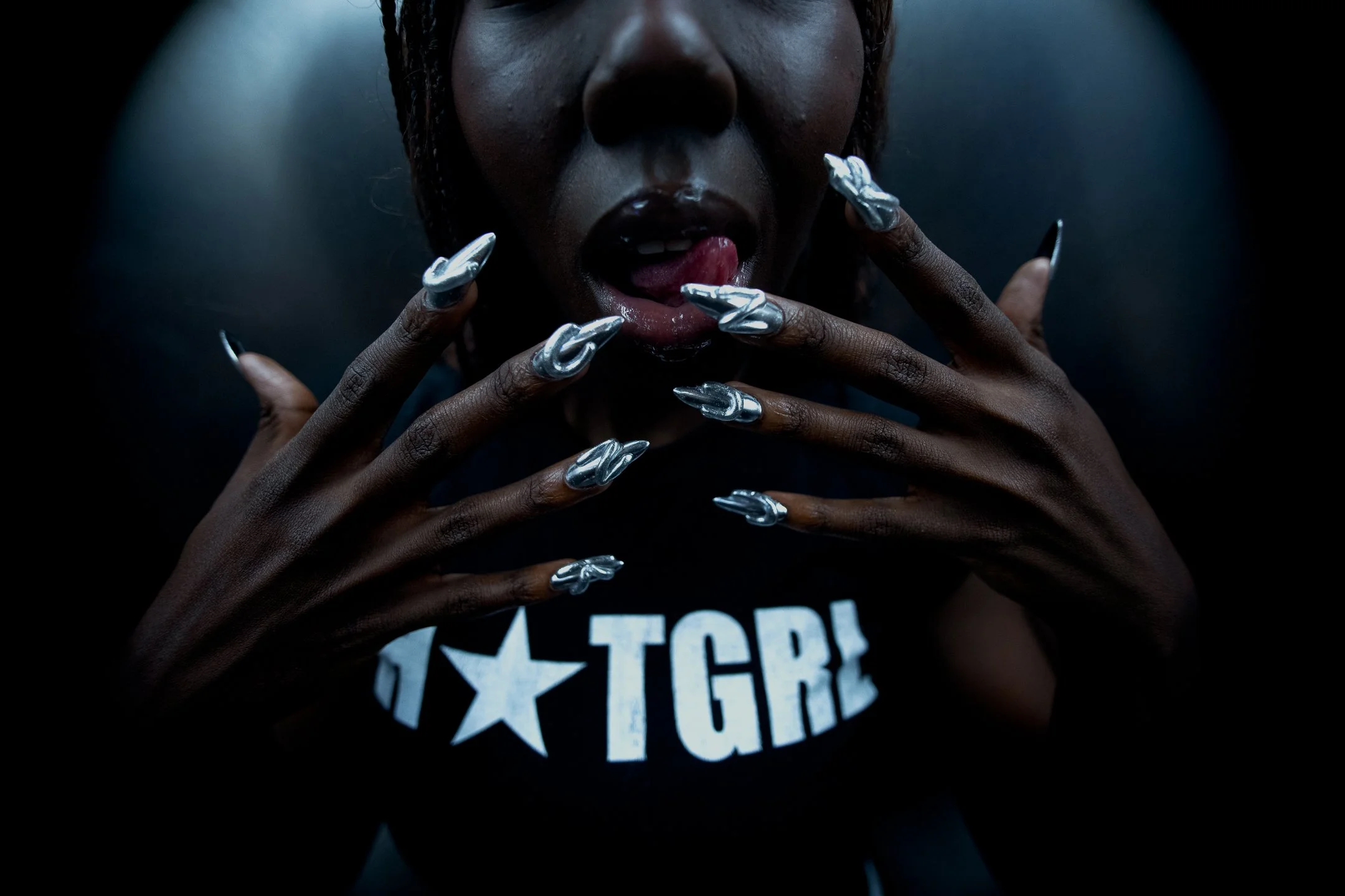
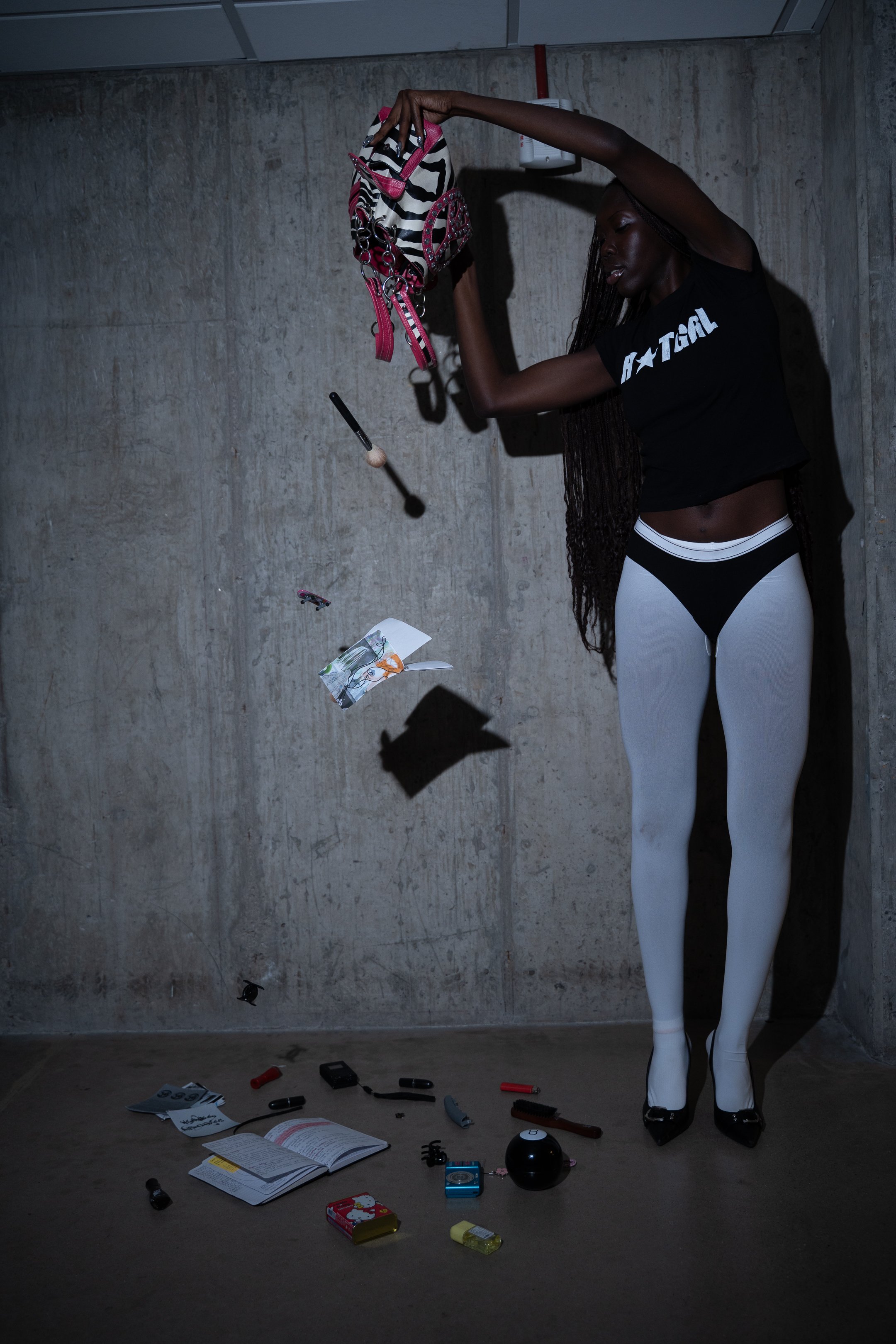
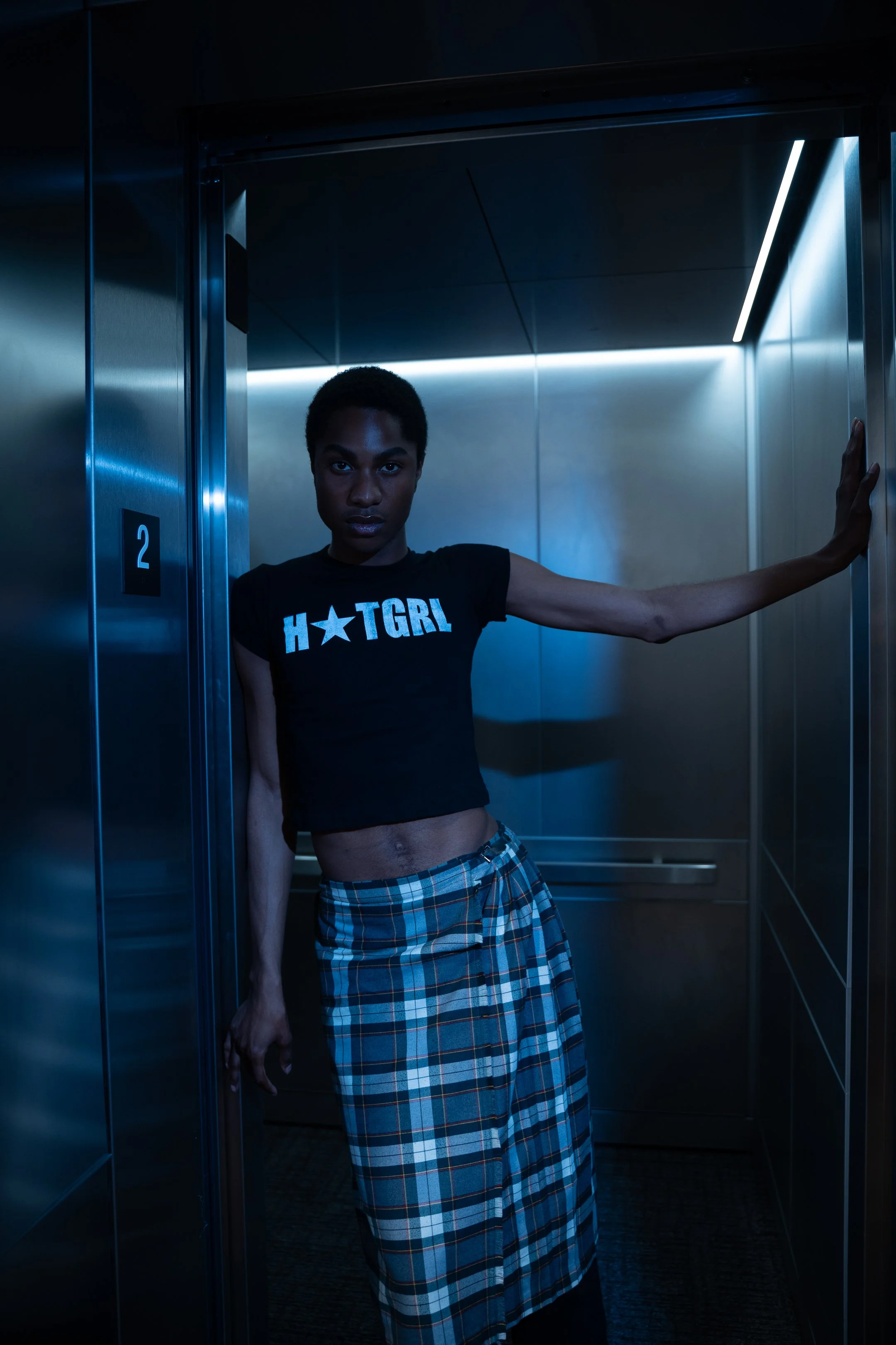
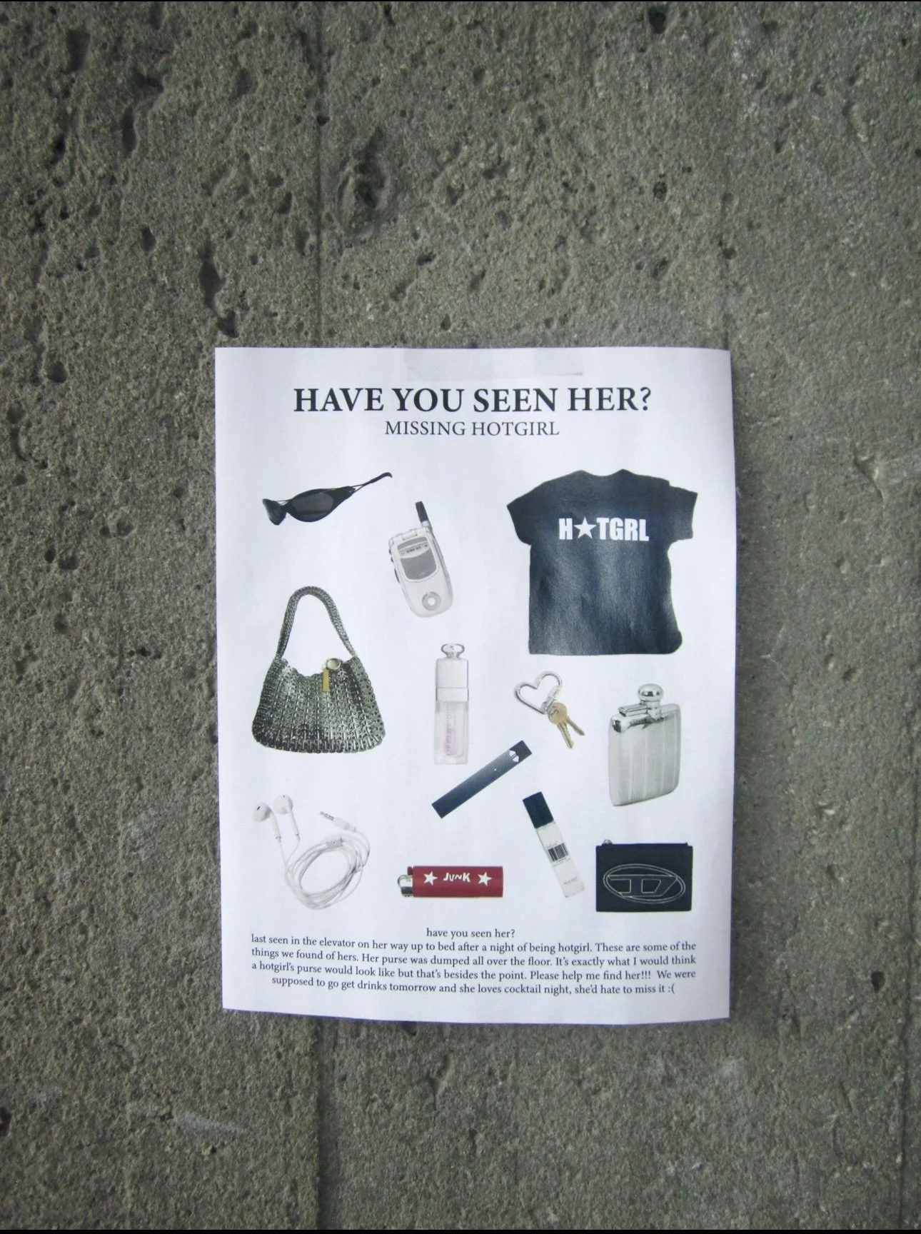
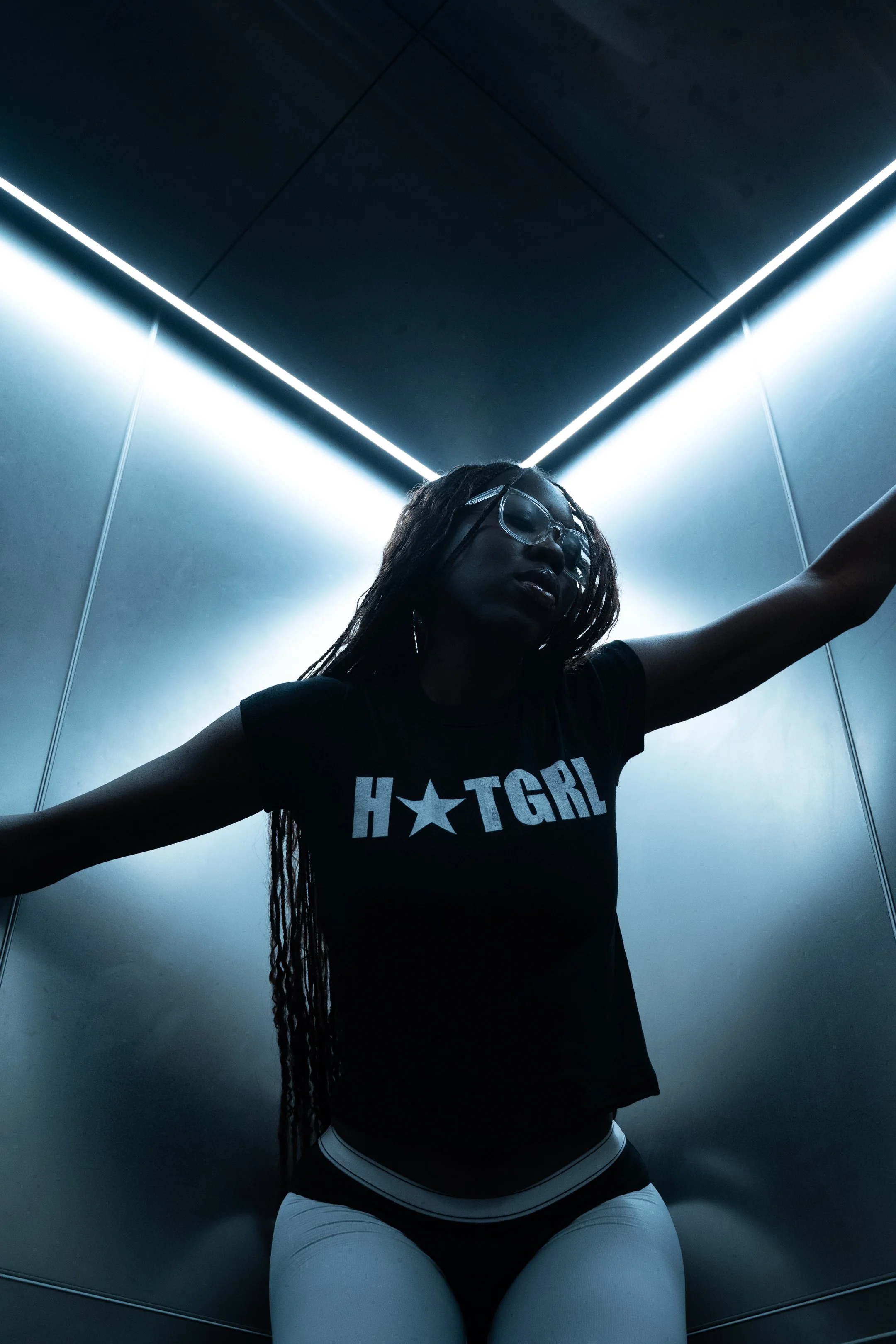
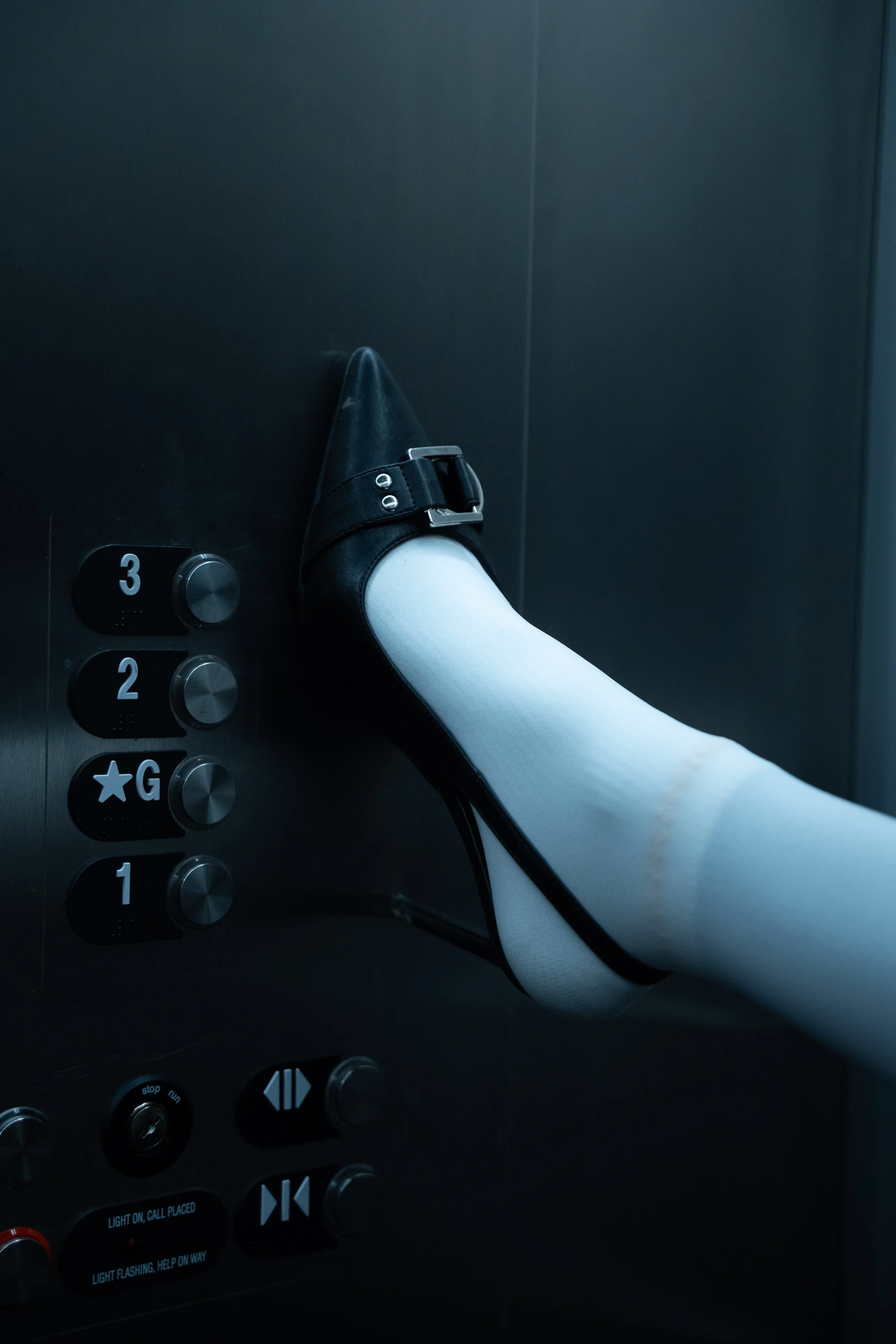
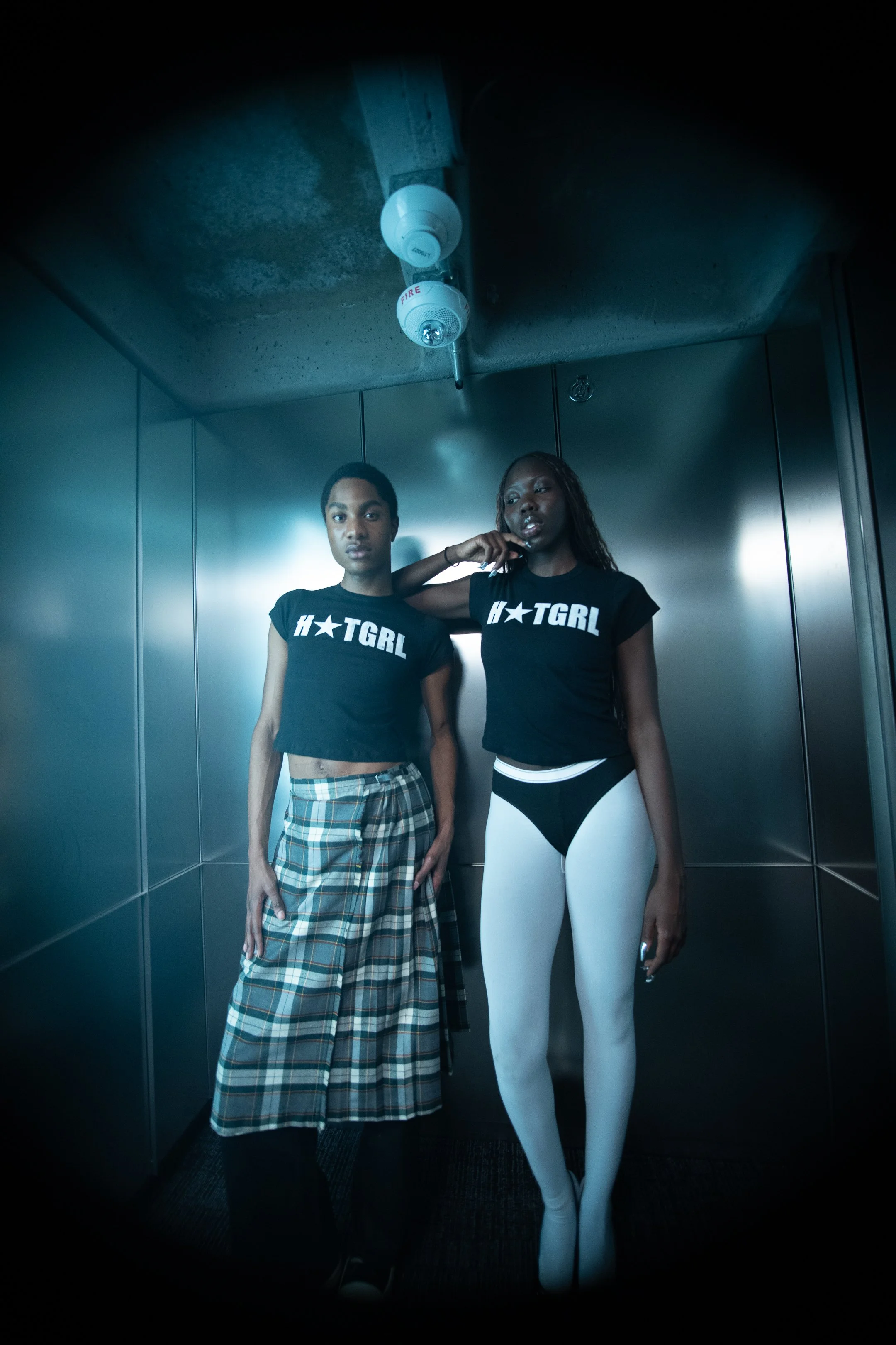
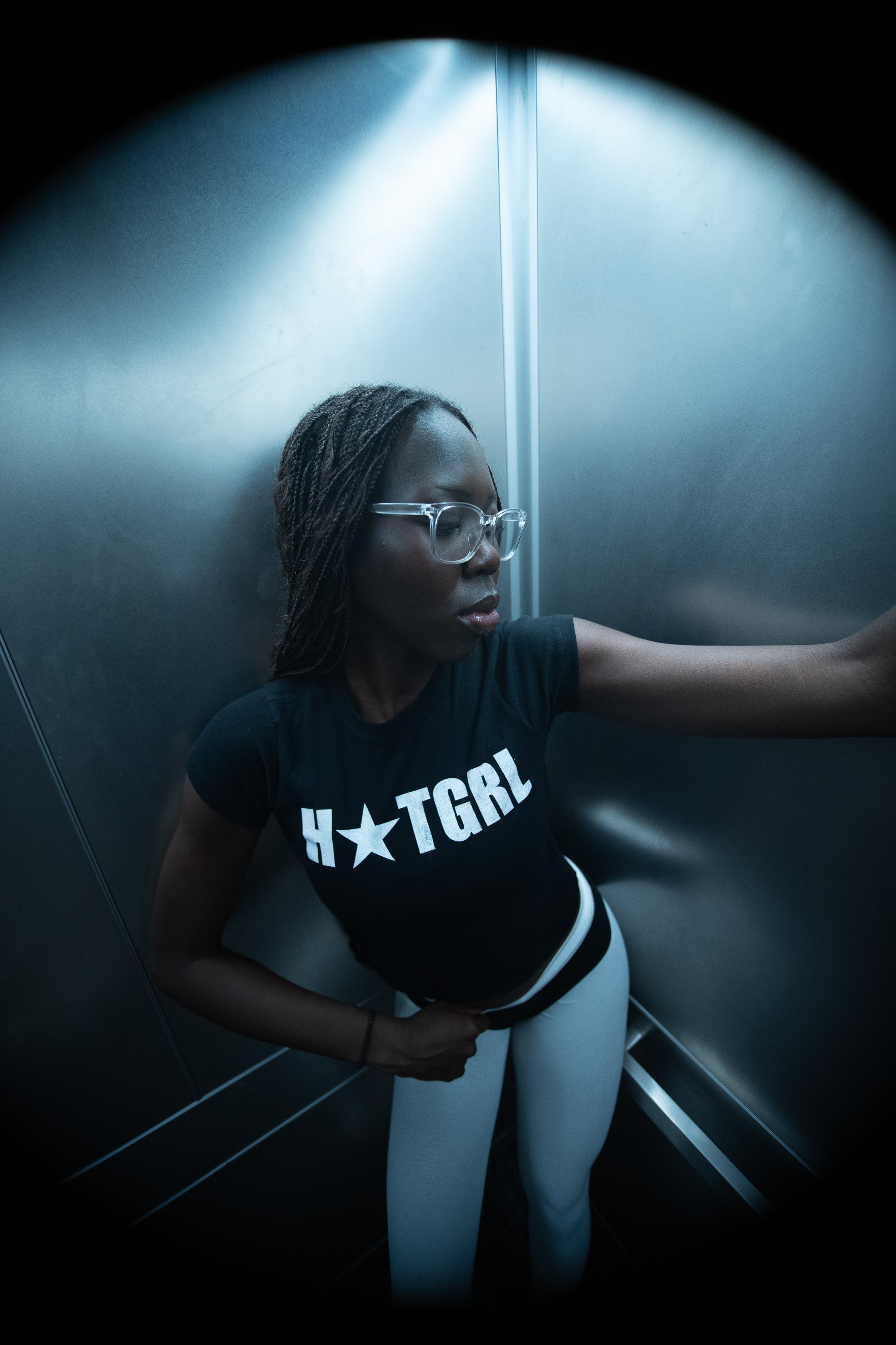
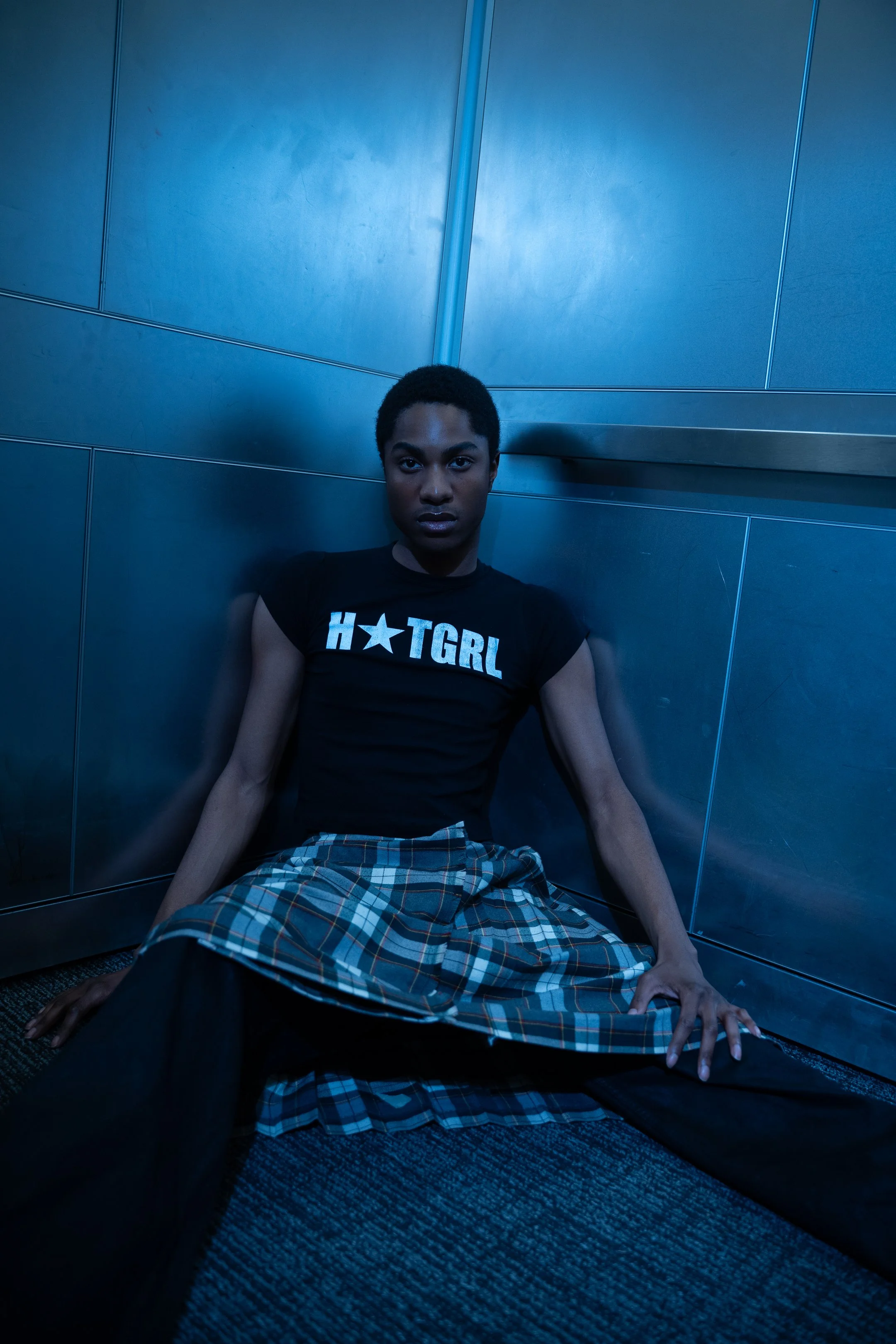
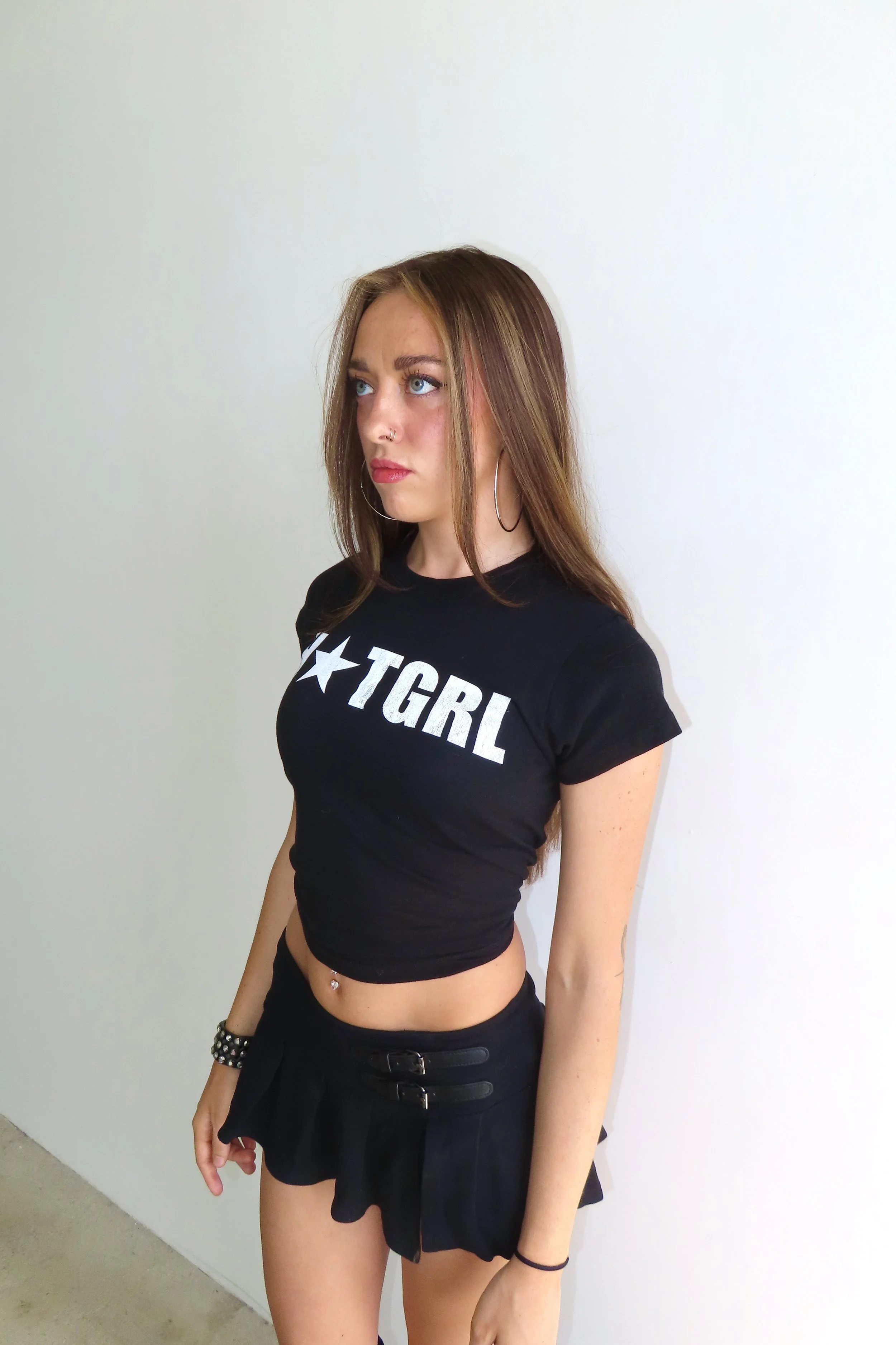
The “Hotgirl” Tee
I went to the Pinterest drawing board to help convey my vision for this shirt to my photographer (2ndsonprod). He really helped bring this idea to life, and it was cool to collaborate with someone who had an eye for these things. The color palette really stands out to me, with dark blues and chromes that carry a cold, unbothered tone. The setting isn’t glamorous, but the shots still have an editorial quality. Everything feels like it’s happening at 3AM in a place you’re not supposed to be. It pushes at the boundaries of beauty and discomfort.